

How to Pick a Cozy Color Palette for Your Studio Apartment
Picking a cozy color palette for a studio apartment feels harder than it should. In one open room, your walls, bedding, sofa, curtains, and kitchen cabinets all sit in the same line of sight — so one wrong shade can make the whole space feel cold, chaotic, or strangely unfinished. The good news is that you do not need a designer’s eye or a dozen paint cans to get it right. You just need a simple step-by-step method that works with the space you already have.
This guide walks you through exactly how to pick a cozy color palette for your studio apartment, from reading your natural light to testing swatches the smart way. You will finish with a palette of three to five colours you can shop from with confidence — and two ready-to-use cozy palette examples you can copy straight away. Let us start where every good palette starts: with your light.
1. Start With the Light You Actually Have
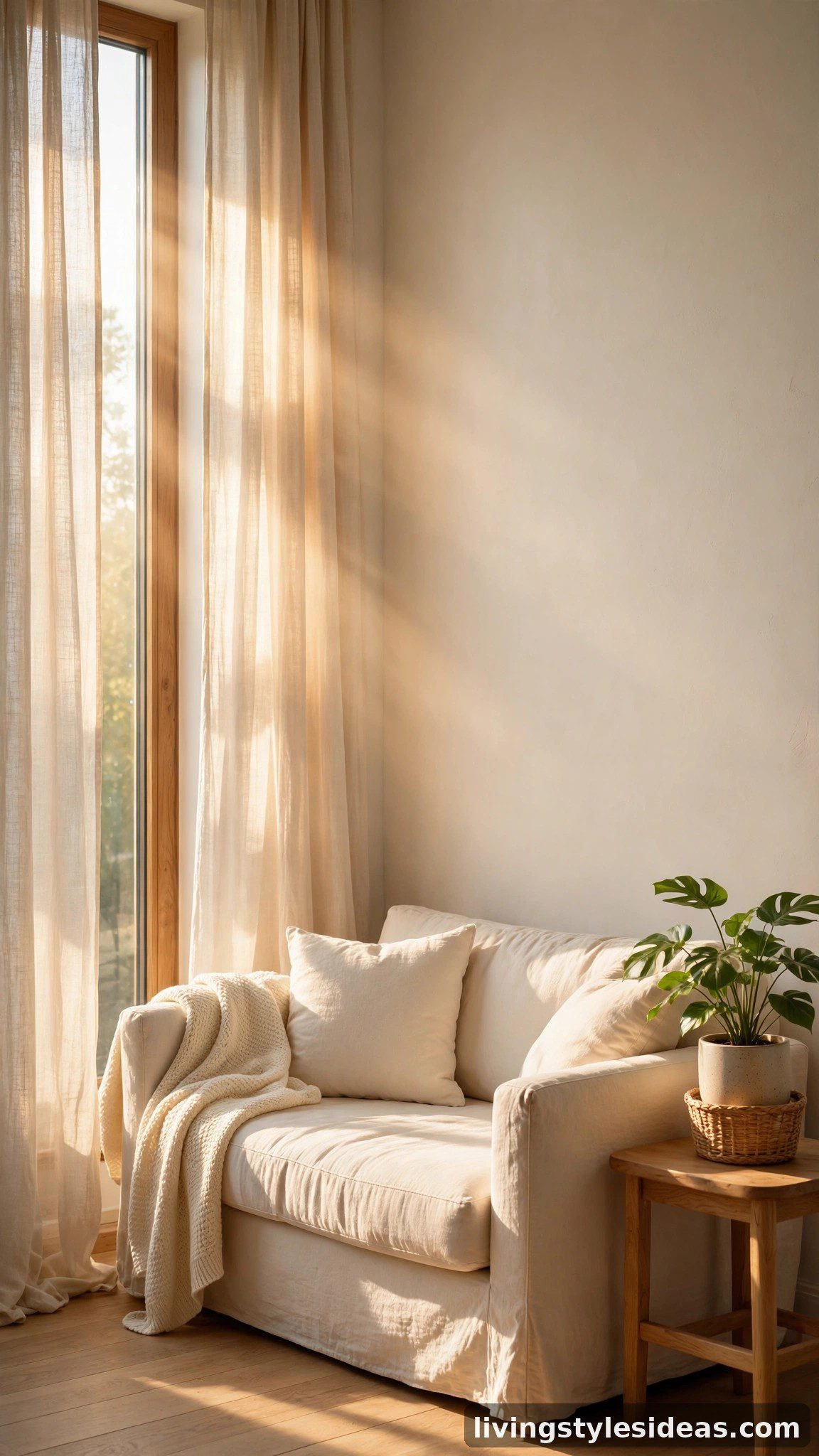
Before you look at a single paint swatch, stand in your studio at three different times of day — morning, midday, and after sunset — and simply watch how the light behaves. North-facing windows give cool, bluish light that can make pale grays feel icy, while south-facing rooms flood everything with warm, golden brightness. Note which corners stay dim and which walls catch the sun. This five-minute habit is the single most reliable way to avoid choosing a palette that looks perfect online but falls flat in your real room.
2. Pick a Warm Foundation Colour First
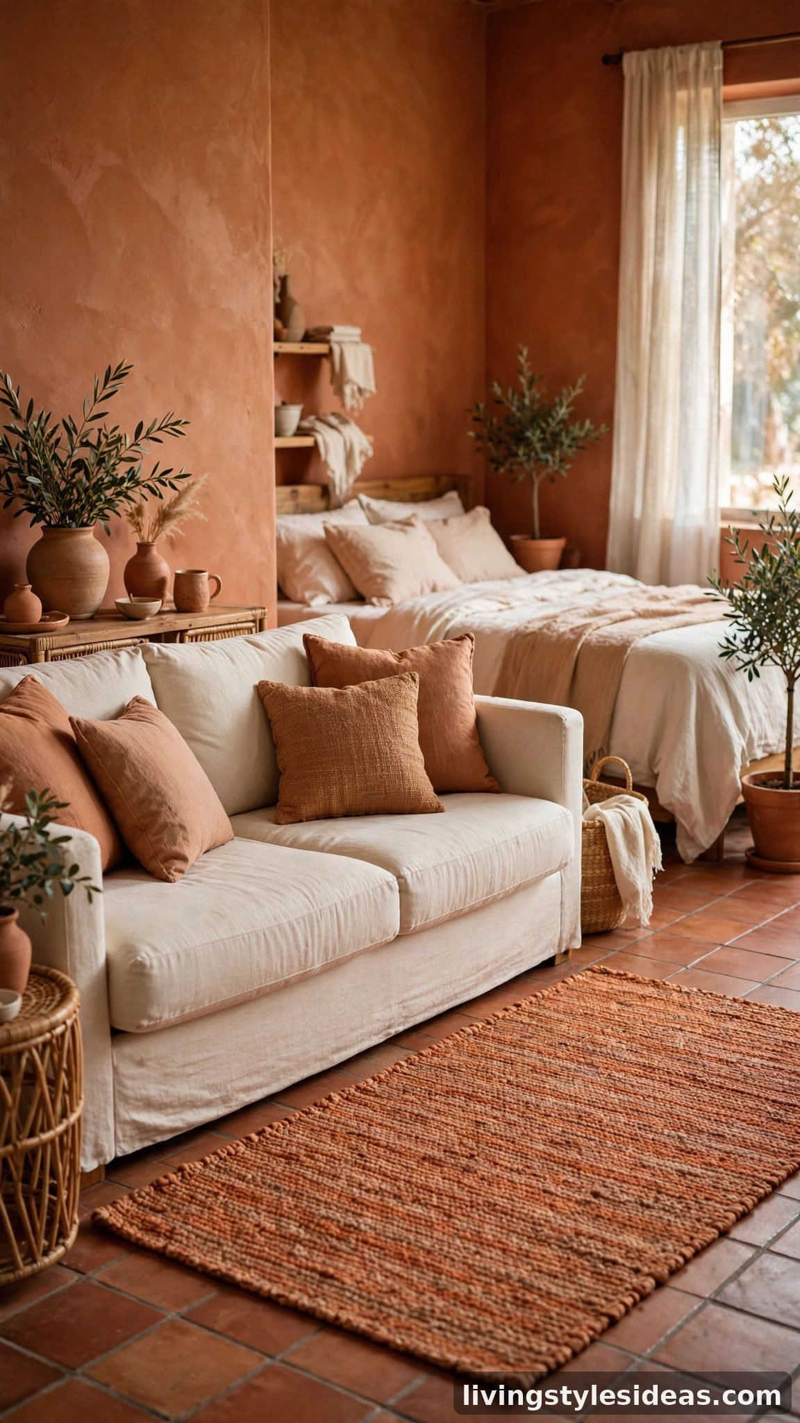
Every cozy palette needs one warm foundation colour that sets the emotional temperature of the room. Think soft terracotta, warm sand, creamy oatmeal, or a gentle clay — shades that feel like sunlight baked into the walls. If you rent and cannot paint, make the foundation a large textile instead: a washable rug, a duvet cover, or floor-length curtains in your chosen warm tone. This single dominant warm layer instantly makes the studio feel intentional, and every colour you add afterwards will hang on it naturally.
3. Choose a Quiet Neutral to Do the Heavy Lifting
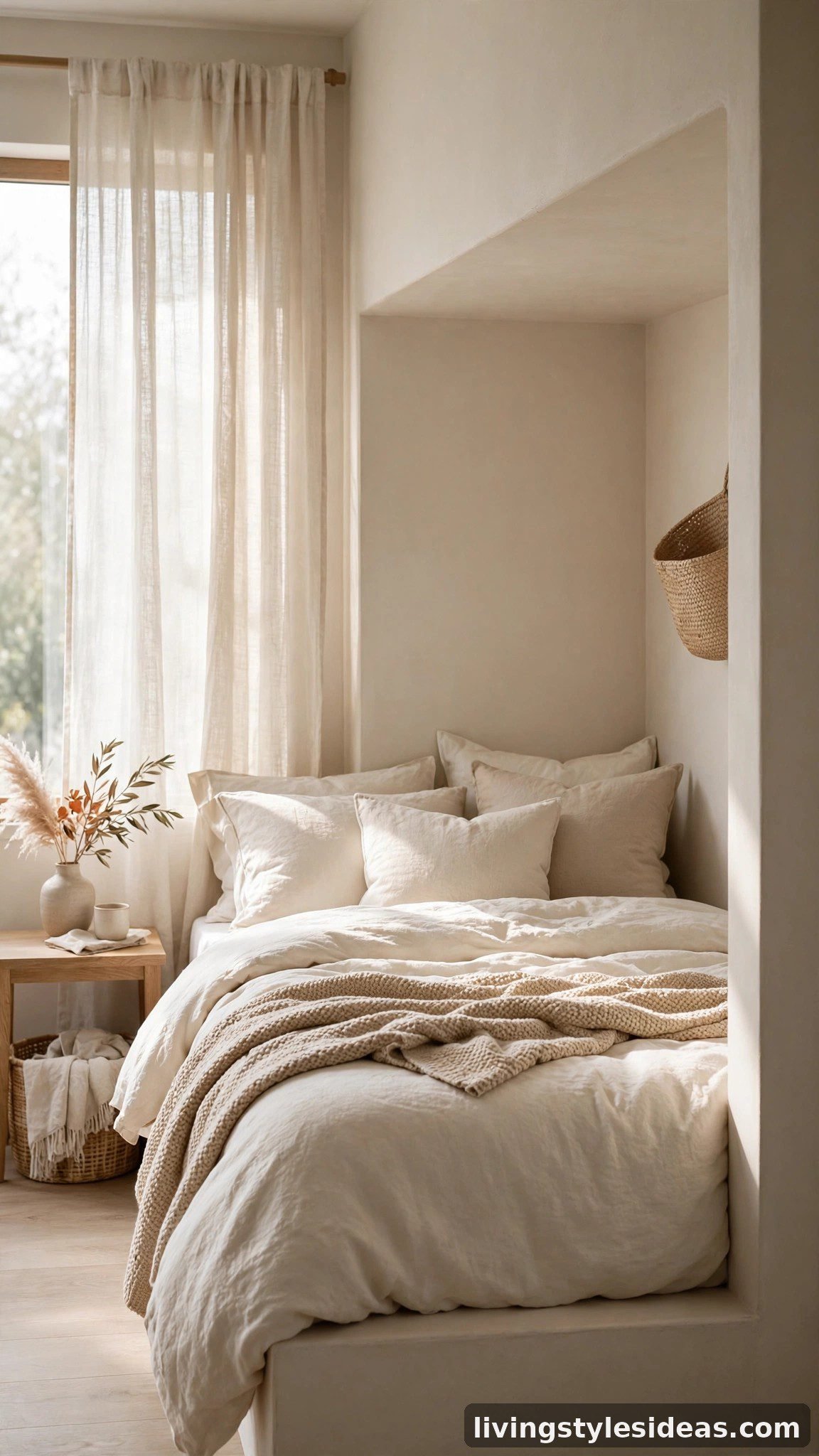
Next, pick a quiet neutral that will cover your biggest surfaces — walls, bedding, and large furniture. Warm white, ivory, linen beige, and soft greige are studio favourites because they bounce light around a small room while still feeling cozy rather than stark. Avoid blue-based or purple-based whites, which quietly fight with warm foundations and make everything feel colder. Your neutral should look good next to your skin tone in a mirror; if it flatters you, it will flatter your room every single day.
4. Add One Deep Anchor Shade for Coziness
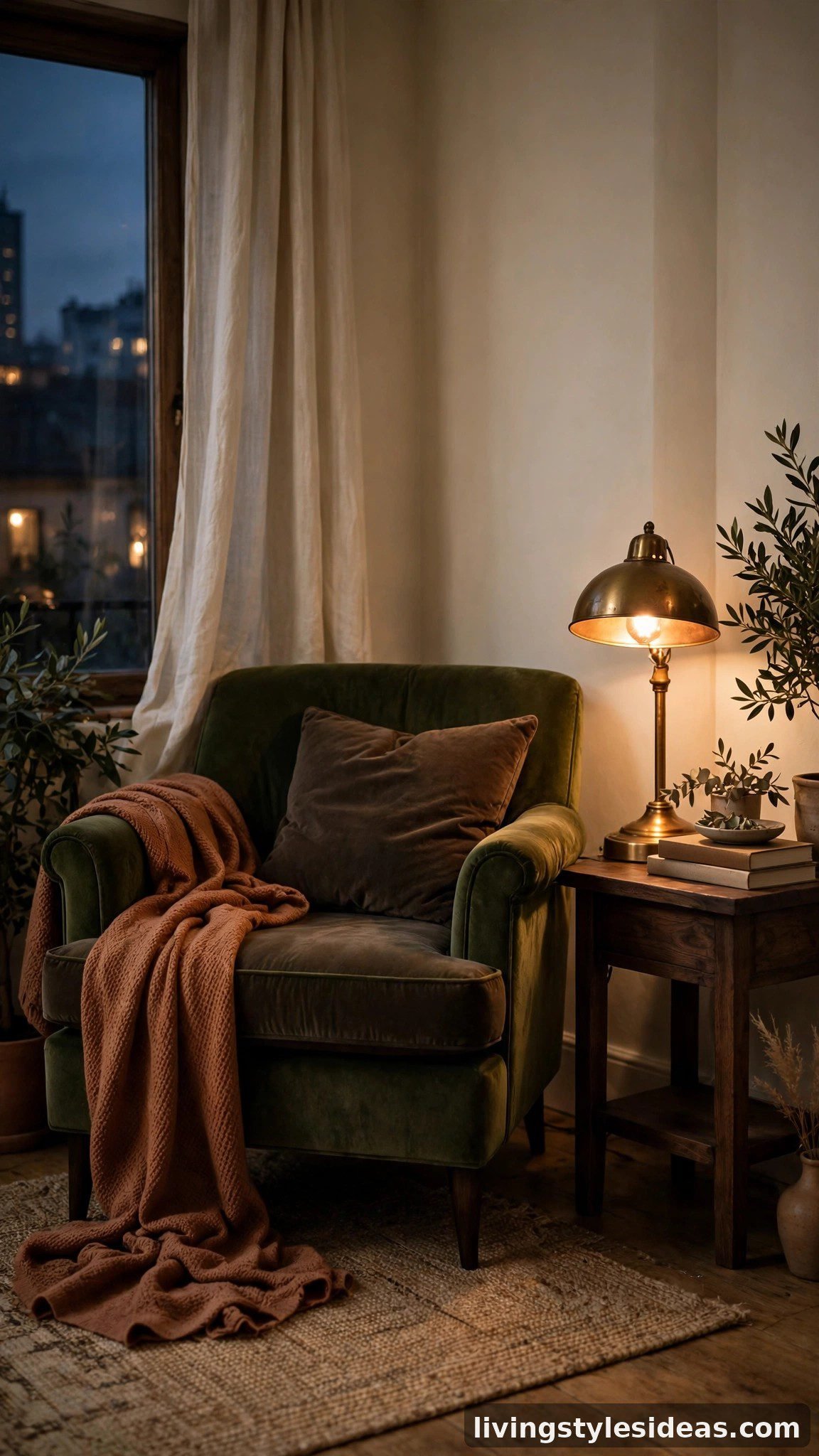
A palette of only soft tones can start to feel washed out, so give your studio one deep anchor shade to ground it. Espresso brown, deep olive, charcoal plum, or inky navy all work beautifully as the “weight” in the room. Use it sparingly on pieces with visual gravity: a headboard, a reading chair, cushion covers, or the frames of your artwork. This contrast is what makes a small space feel layered and cocoon-like instead of flat — it is the difference between a room that looks decorated and one that merely looks pale.
5. Build the Palette With the 60-30-10 Rule
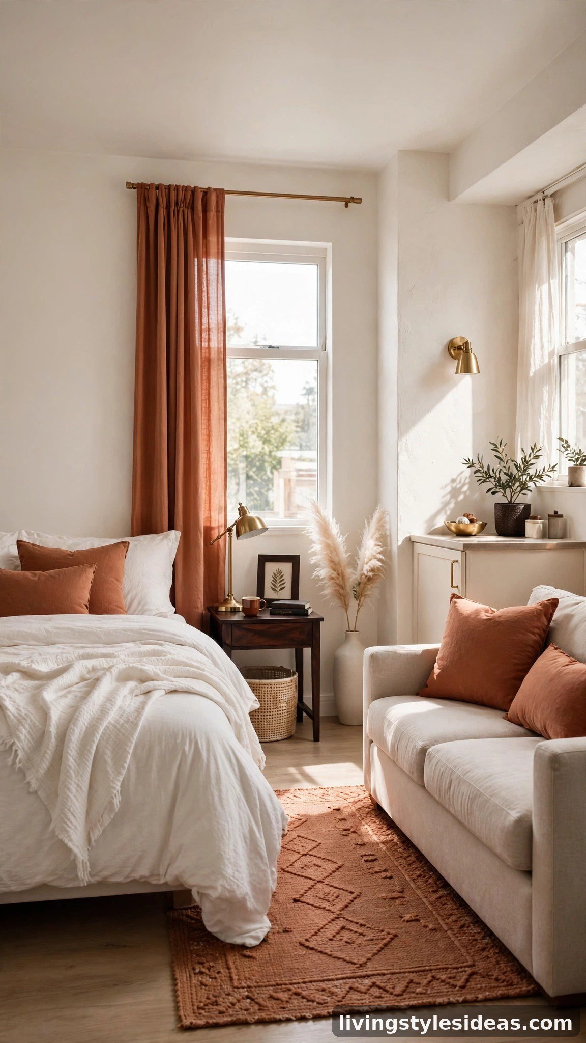
Now assemble your colours using the decorator’s 60-30-10 rule: roughly 60 percent of the room in your quiet neutral, 30 percent in your warm foundation, and 10 percent in your deep anchor plus small accents. In a studio, that might mean ivory walls and bedding, a terracotta rug and curtains, and espresso cushions with brass details. The rule is not about measuring — it is about balance. When each colour earns its share, the whole room feels calm and pulled together, even though it holds your bed, sofa, desk, and dining table in one open space.
6. Test Swatches in Day and Lamplight

Colours lie in the store and tell the truth at home, so always test before you commit. Tape paper swatches or fabric samples to the wall beside your sofa and bed, then check them in bright daylight and again under your evening lamps — warm bulbs can shift a beige greige toward peach, while cool bulbs push it toward gray. Live with the samples for two days. The swatch you still love on the second evening, in the light you actually use, is the right one. This tiny pause saves more studio makeovers than any other step in this guide.
7. Zone Your Studio With Colour, Not Walls
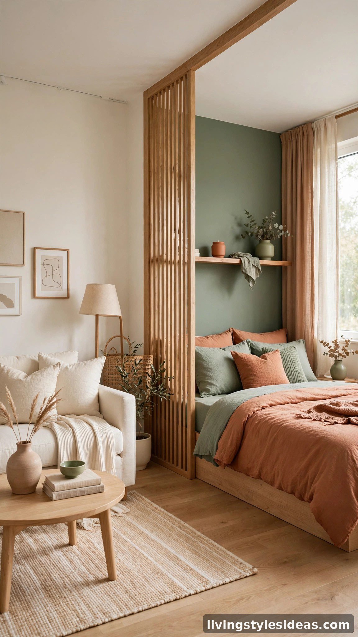
A studio has to work as a living room, bedroom, and often an office, and colour can quietly draw those boundaries for you. Keep the palette consistent but shift the proportions in each zone: let your sleeping corner lean deeper and softer with anchor-shade bedding, keep the living zone brighter with more neutral, and echo your foundation colour on the desk chair. Because every zone repeats the same three to five colours, the room reads as one harmonious home rather than three clashing corners fighting for attention.
8. Repeat Each Colour at Least Three Times
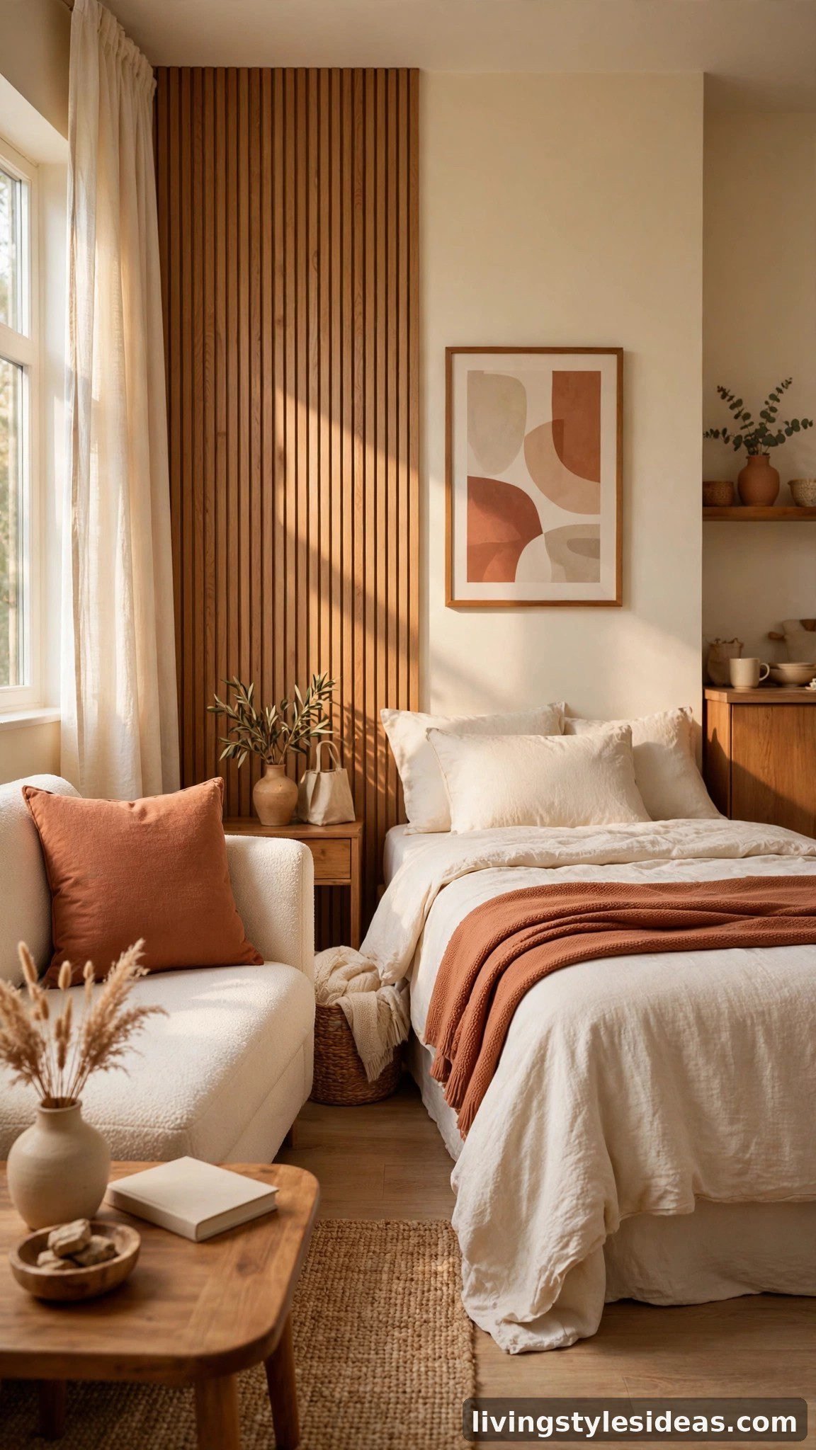
Here is the stylist’s trick that makes any palette feel designed: every colour in your studio should appear at least three times, in different materials. Your terracotta might show up in a cushion, a throw over the bed, and the tones of a framed print across the room. Your anchor shade could return in a lampshade, a book stack, and a planter. Repetition creates rhythm, and rhythm is what the eye reads as “cozy and intentional.” One lonely pop of colour almost always looks like a mistake — three quiet echoes look like a plan.
9. Deepen the Palette With Texture, Not More Colours
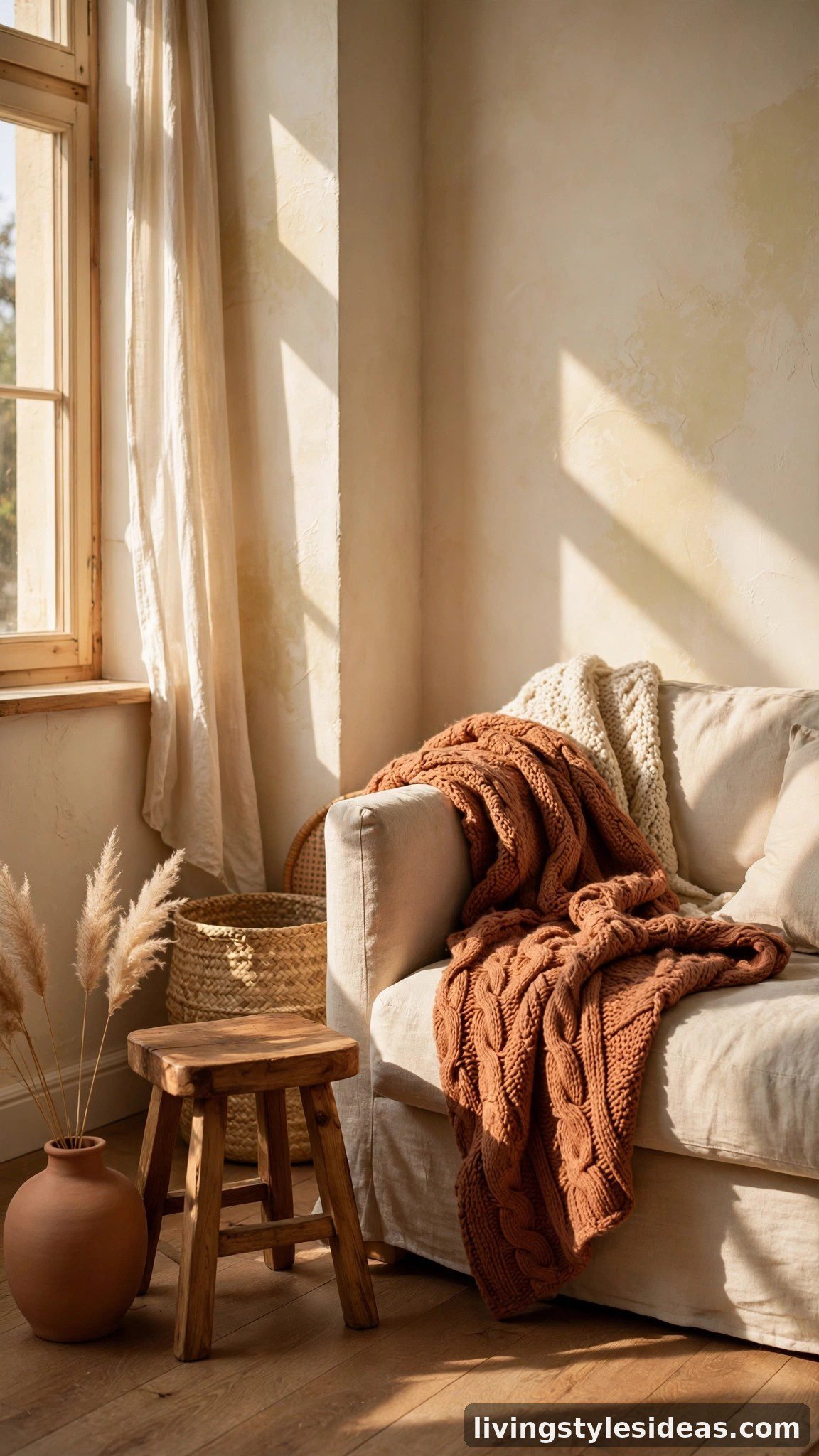
When a studio palette feels nearly right but somehow flat, the answer is texture, not another colour. A chunky knit throw, nubby linen curtains, a woven seagrass basket, matte ceramics, and warm wood tones all add depth while staying inside your chosen palette. Texture is also how cozy actually happens: soft, tactile layers absorb light unevenly, which makes colours look richer and the room feel physically warmer. Stick to your three to five shades and vary the surfaces instead — your palette stays calm while the room gains all the snug, layered character you want.
10. Write Your Palette Down and Shop From the List
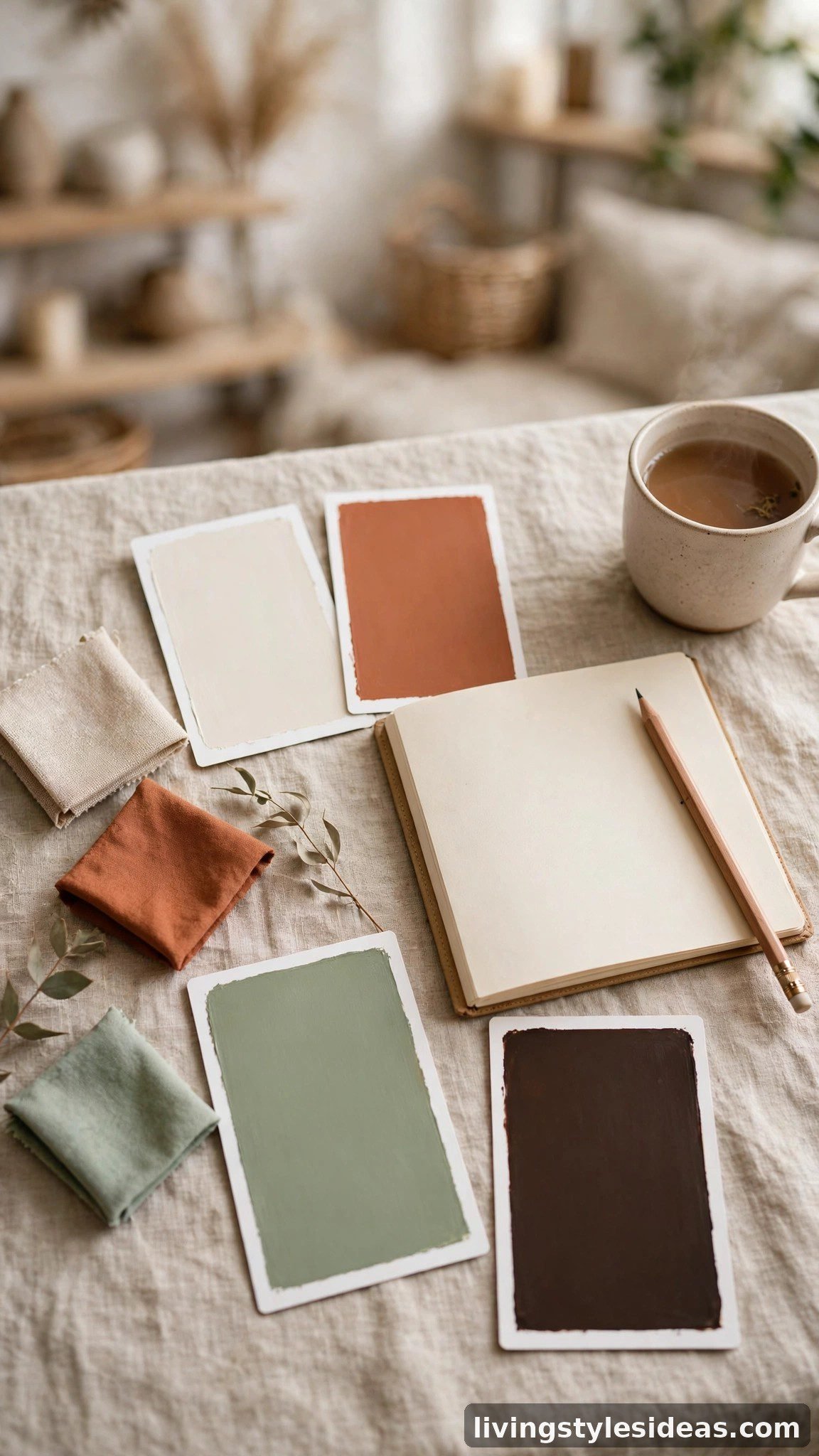
Finally, turn your palette into a simple shopping list: snap photos of your swatches, name your three to five colours, and keep the list on your phone. From now on, every cushion, print, and candle gets one question — is it on my palette? This single habit stops impulse buys from slowly wrecking your scheme. To see the method in action, try copying a proven example palette: warm white walls, a terracotta rug, sage cushions, and espresso wood. Or go moodier with greige walls, caramel textiles, deep olive accents, and cream bedding. Both follow every step above, and both will make a small studio feel like a warm, deliberate home.
Frequently Asked Questions
How many colours should a studio apartment palette have?
Three to five colours is the sweet spot for a studio. Fewer than three can feel flat and unfinished, while more than five tends to look chaotic in one open room. Stick to one warm foundation, one quiet neutral, one deep anchor, and one or two small accents, then let texture — not extra colours — add the richness.
What is the coziest colour for a small studio apartment?
Warm, muted mid-tones are the coziest choices: terracotta, warm sand, caramel, sage, and soft clay all make small rooms feel wrapped in warmth. If you love cooler colours, choose dusty, gray-softened versions like slate blue or eucalyptus, and balance them with warm lighting and natural wood so the room still feels snug.
Can I use dark colours in a tiny studio without making it feel smaller?
Yes — used as an anchor rather than a blanket, dark colours actually make a studio feel bigger by adding depth. Keep dark shades on about ten percent of the room: a headboard, cushions, an armchair, or picture frames. Paired with a light neutral on the biggest surfaces, deep tones read as cozy and sophisticated, never cramped.
How do I make a rental studio feel cozy with colour if I cannot paint?
Build your palette with textiles and large removable pieces instead of walls. A sizable rug in your foundation colour, curtains hung high and wide, bedding in your neutral, and cushions in your anchor shade can completely change the room’s temperature. Peel-and-stick wallpaper in one warm tone on a single wall is another renter-friendly way to lock in your palette.
Final Thoughts
Picking a cozy color palette for your studio apartment is not about luck or talent — it is a sequence of small, learnable decisions. Read your light, choose a warm foundation and a quiet neutral, ground the room with one deep anchor, and let the 60-30-10 rule keep everything in balance. Test your swatches properly, zone with colour, repeat each shade at least three times, and deepen the look with texture rather than extra colours. Do that, and your one small room will feel warm, cohesive, and unmistakably yours. Start with the palette list this weekend — your coziest studio is closer than you think.