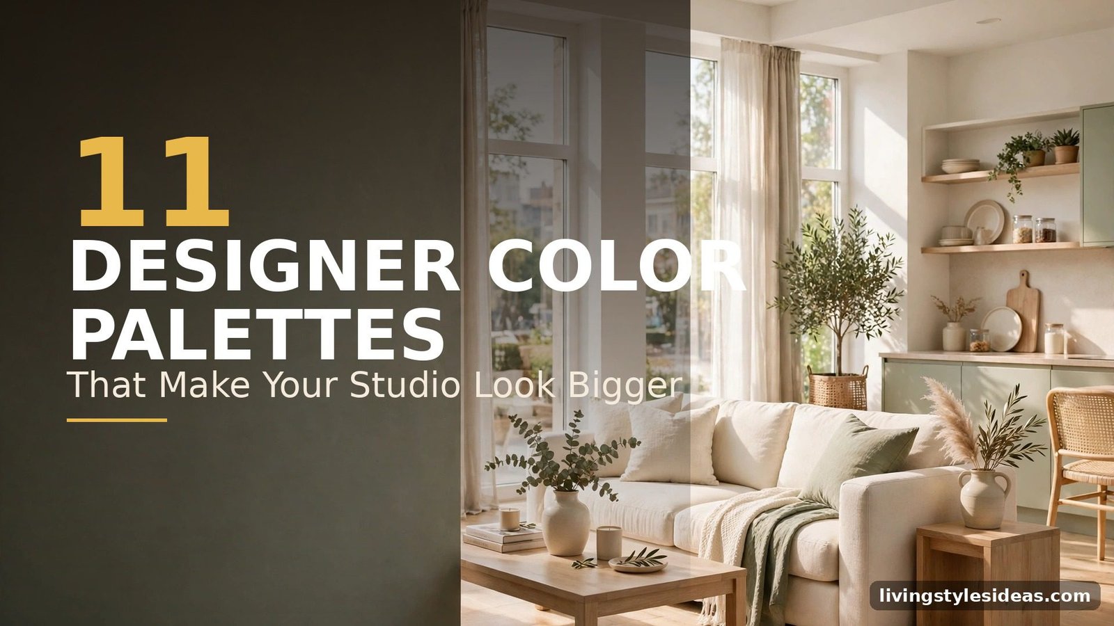
What Colors Make a Studio Apartment Look Bigger? 11 Designer-Approved Palettes
Paint is the cheapest square-footage hack you will ever buy. Designers know that the right palette can blur walls, bounce light into corners, and make a 400-square-foot studio feel like a proper one-bedroom — no renovation required. But not all light colors work the same way, and one wrong undertone can leave your space feeling flat instead of open.
That is why I asked working interior designers for the exact palettes they reach for in tiny studios. Below are the 11 color combinations that consistently make small apartments look bigger — each with a real-room look so you can see exactly how to pull it off.
1. Warm White + Cream
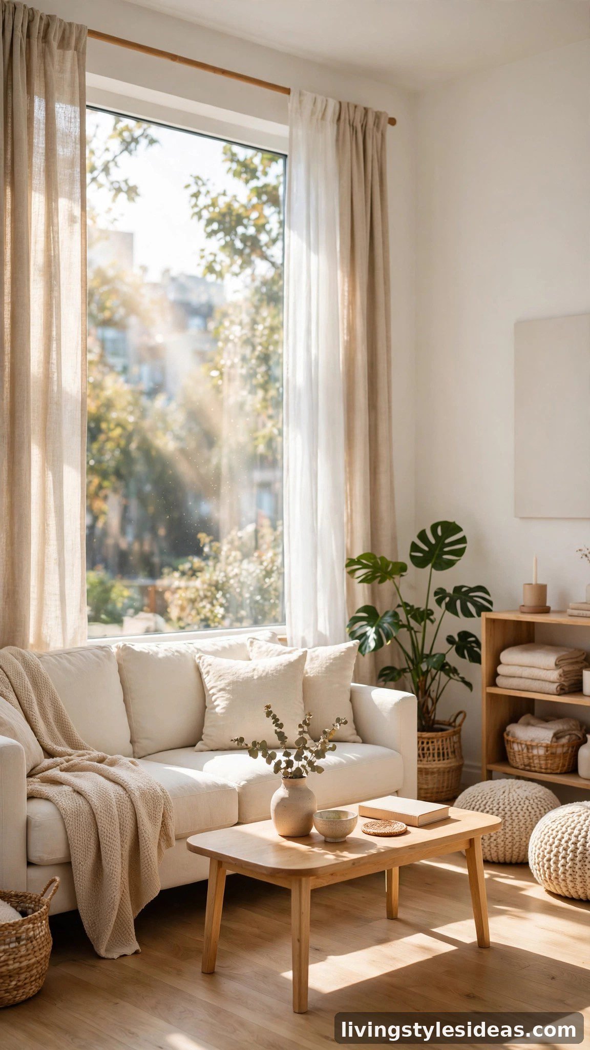
The designer’s default for a reason. Warm whites like Benjamin Moore’s White Dove reflect natural light without the cold, clinical edge of pure white, while cream upholstery layers in softness so the room feels calm rather than sterile. Keep ceilings, trim, and walls in the same warm-white family so edges disappear and the eye travels across the whole studio. Add texture — linen curtains, a nubby wool rug — instead of contrasting colors to keep the look rich and cohesive.
2. Soft Greige + Linen
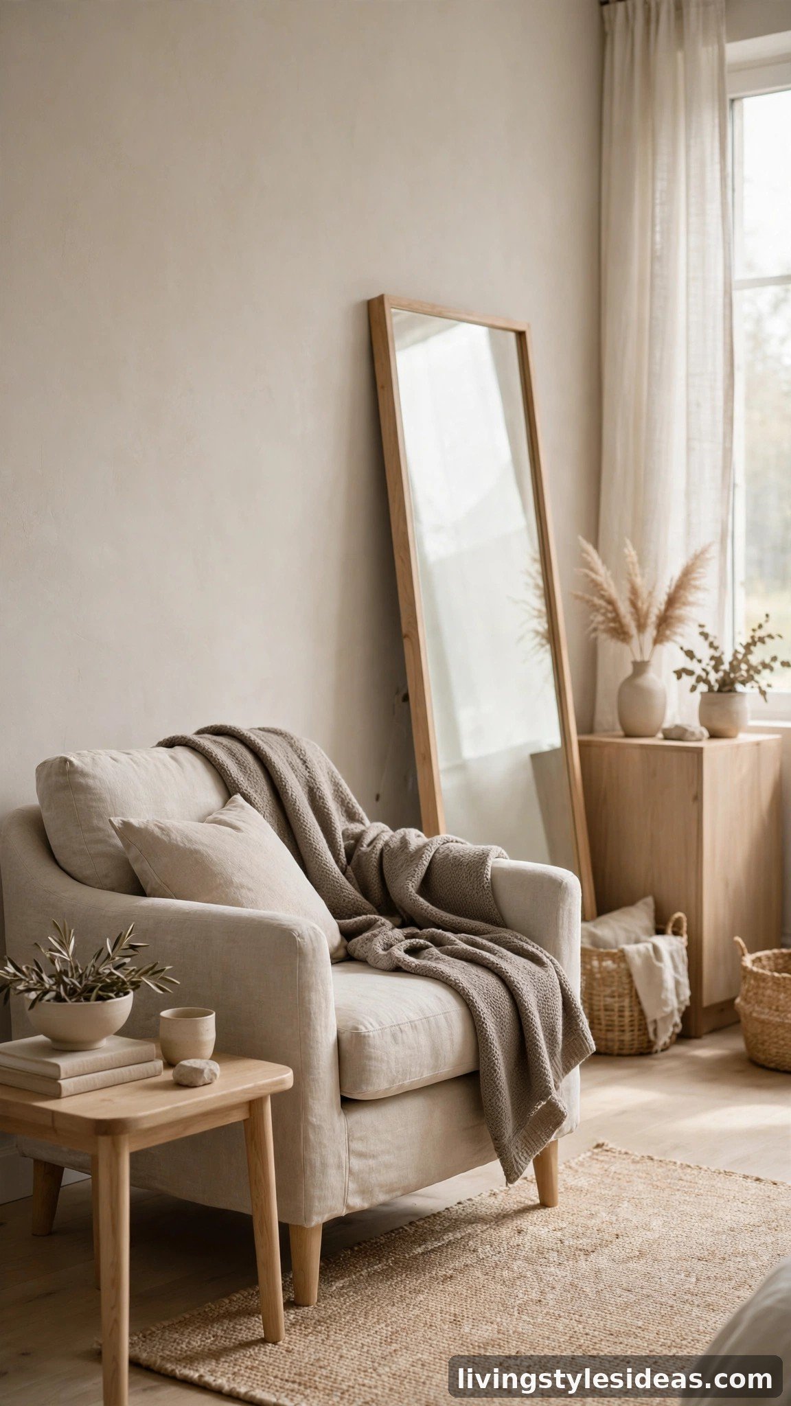
Greige — the happy marriage of gray and beige — is the neutral that designers pick when white feels too stark but they still need airiness. It reads warm under lamplight and cool in daylight, so your studio feels bright. Pair it with washed-linen bedding and a light oak dresser to build a soft, tonal room where nothing visually chops up the space. A large leaning mirror in a pale wood frame doubles the daylight and the perceived square footage.
3. Light Sage + White
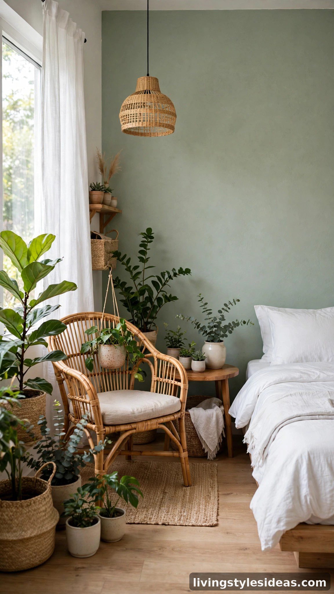
Sage green is the accent color designers love for small spaces because it recedes like a neutral yet brings nature’s calm indoors. Paint one wall — the one behind the bed or sofa — in a whisper-soft sage, and keep everything else white. The green reads as a gentle focal point instead of a boundary, so the room feels layered rather than smaller. Rattan pieces and leafy plants extend the botanical mood, making the palette feel intentional, not accidental.
4. Pale Blue-Gray + White
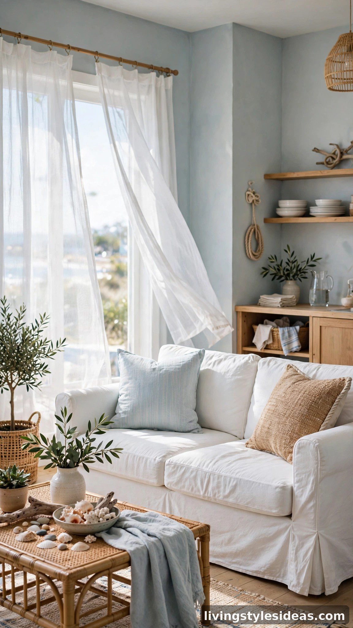
There is a reason coastal cottages feel breezy: pale blue-gray walls mimic sky and sea, and the eye associates those tones with open space. Designers call it the “expanding color” because cool tones visually push walls outward. Pair it with a white slipcovered sofa and sheer curtains that filter light without blocking it. Woven seagrass baskets add warmth so the palette never turns icy — you get the airiness of blue with the coziness of a beach house.
5. Warm Beige + Caramel
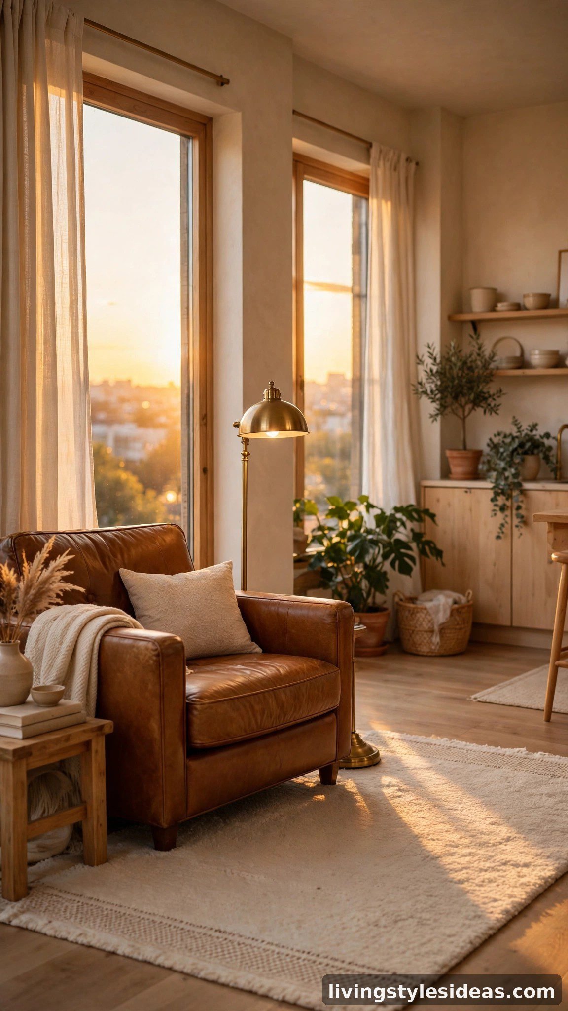
If all-white studios feel soulless to you, this palette delivers the same brightness with far more warmth. Warm beige walls glow in afternoon sun, and one caramel leather chair anchors the seating area without weighing it down. Brass and amber glass accents catch the light and scatter it around the room, which is the oldest designer trick for making corners feel farther away. Finish with a cream rug to keep the floor reading as one continuous plane.
6. Soft Blush + Ivory
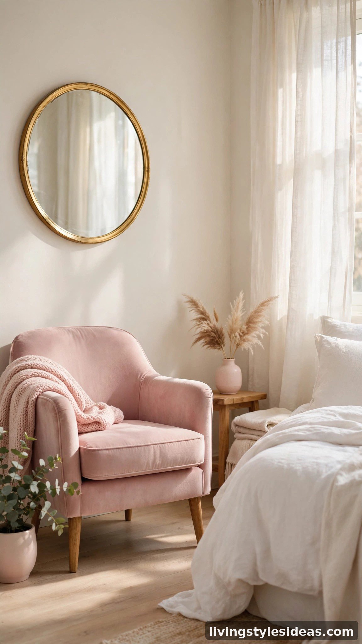
Blush sounds risky in a small space, but designers love it because pale pink reflects light almost as well as white and adds a flattering glow no gray can match. Keep it restrained: ivory walls with blush confined to upholstery, cushions, and one piece of art. Soft warmth makes morning light feel golden even on cloudy days, and the room reads bigger as your eye glides across the low-contrast scheme. A round gold mirror adds jewelry and multiplies the light.
7. Light Gray + Crisp White
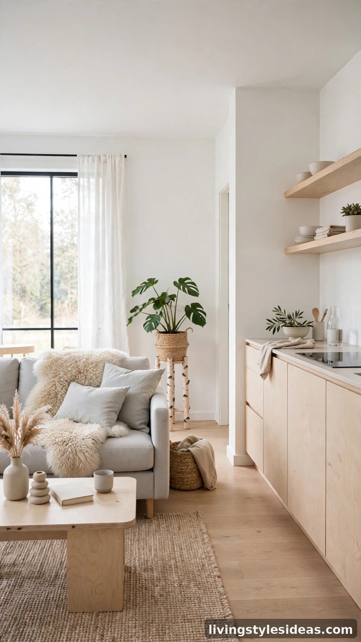
The Scandinavian formula works because it removes every visual obstacle. Light gray on the walls, crisp white on the ceiling and trim, and pale birch furniture that practically floats against them. Designers insist on one rule: keep all tones within two shades of each other so the room becomes one continuous envelope of light. A sheepskin throw and a single black floor lamp add just enough contrast to keep the palette from feeling washed out, without breaking the open feel.
8. Warm Taupe + Champagne
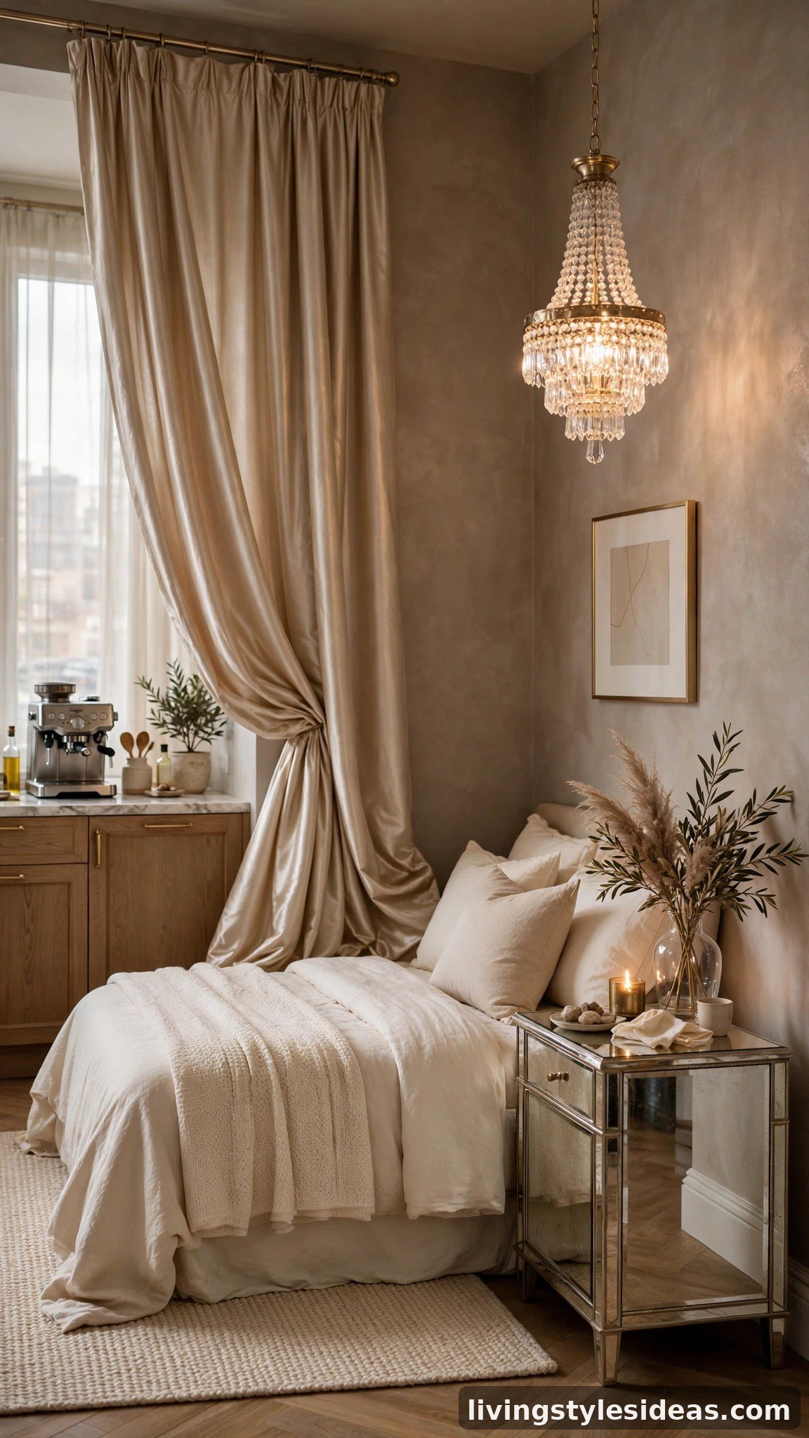
For renters who want small to feel luxurious rather than just light, this is the palette designers reach for. Warm taupe walls are deeper than beige but still bounce light, and champagne silk curtains shimmer as they catch it — motion and shine trick the eye into perceiving more space. Mirrored side tables and a crystal pendant multiply every light source. The result feels like a boutique hotel suite, proof that a studio can be both tiny and glamorous.
9. Pale Yellow + Cream
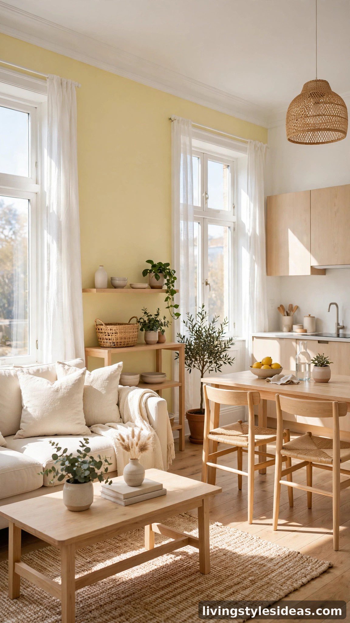
North-facing studios that never get direct sun are this palette’s best use. Pale yellow walls simulate sunlight, so the whole apartment feels brighter than its exposure. Designers temper the cheerfulness with cream upholstery and white trim, keeping the yellow light rather than loud. Because yellow advances toward the eye, limit it to one wall and let the others stay cream — you get the glow without the room closing in. Fresh flowers complete the sunny illusion.
10. Warm White + Terracotta Accents
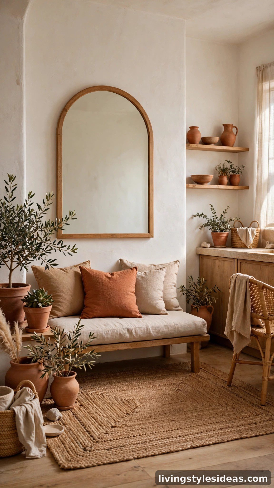
This is how you get warmth and personality without sacrificing openness: keep the architecture — walls, ceiling, floors — in warm white, and bring all the color through easily changeable accents. Terracotta pots, rust cushions, and a jute rug add earthy richness at eye level, while the pale shell around them keeps the boundaries invisible. Renters love this approach because every bit of color can leave when you do.
11. Soft Mint + White
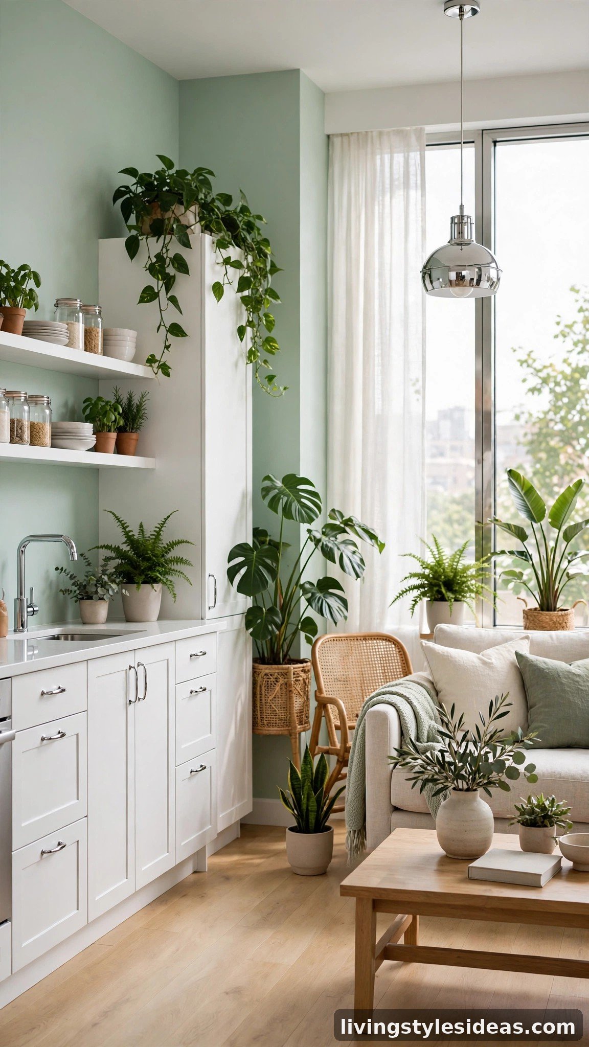
Mint is the wildcard palette because it does two jobs at once: it visually recedes like pale blue and feels fresh like pale green. Use it on the kitchen wall or sleeping alcove for subtle zone definition, keeping the rest of the studio white. Chrome and glass accents scatter the mint tint, so the color feels woven through the whole space rather than boxed into one corner. Add plants, and the room practically breathes.
FAQ
What is the best wall color to make a small studio look bigger?
Warm whites and very pale neutrals are the safest choice — they reflect the most light and erase the visual edges where walls meet ceilings. If you want more personality, pale blue-grays and soft sages are the designer favorites because cool tones naturally recede and push walls outward. The key is keeping the ceiling, trim, and walls in the same tonal family so nothing breaks the eye’s path across the room.
Should I paint all the walls the same color in a studio apartment?
Usually, yes. One continuous color makes a studio read as a single open space instead of chopped-up zones. The one exception designers allow: a single accent wall in a soft, receding tone (like sage or pale blue-gray) can add depth without shrinking the room. Avoid dark or high-contrast accent walls — they create a visual stop that makes the space feel smaller.
Do dark colors ever work in a studio apartment?
They can, but strategically. A deep color on a single wall — like a moody green behind the bed — can blur that wall’s boundaries in evening light and make it feel farther away. The catch is that dark colors absorb light, so you need excellent lighting and plenty of pale surfaces elsewhere to compensate. For most people, the 11 light palettes above are the safer, more reliable route to a bigger-feeling studio.
How do I choose between warm and cool palettes for my studio?
Let your natural light decide. North-facing or shaded studios get cool, bluish light, so warm palettes (warm white, beige, blush) balance it and add glow. South- or west-facing studios get warm golden light, so cool palettes (pale blue-gray, mint, light gray) keep them feeling fresh instead of overheated. If your studio gets mixed light, greige is the perfect middle ground.
Final Thoughts
Color is the one design element that costs almost nothing and changes everything. Whether you lean toward warm white minimalism or the quiet drama of taupe and champagne, every palette on this list works because it respects the same principle: light, low-contrast color lets the eye travel, and a traveling eye perceives space.
Start with the light you have, pick the palette that flatters it, and keep your biggest surfaces tonal. Your studio may not gain a single square foot — but it will certainly feel like it did.