

17 Cozy Color Palette Ideas for Anyone Living in a Studio Apartment (2026)
Your studio apartment is one open room, which means color has more power here than anywhere else. The right palette doesn’t just decorate your walls — it visually stretches the floor plan, carves out a bedroom corner, a reading nook, or a dining spot, and wraps the whole space in warmth. Instead of thinking in single paint colors, think in palettes: small groups of 3-4 tones that repeat across your bedding, rug, curtains, and art.
Below are 17 cozy color palettes made for small-space living. Each one includes the exact colors to shop for, plus where to use them so your studio feels bigger, calmer, and unmistakably yours. Pin your favorites and build your room around one palette — that’s the whole secret.
1. Terracotta Sunset: Burnt Orange, Clay, Warm Sand & Cream
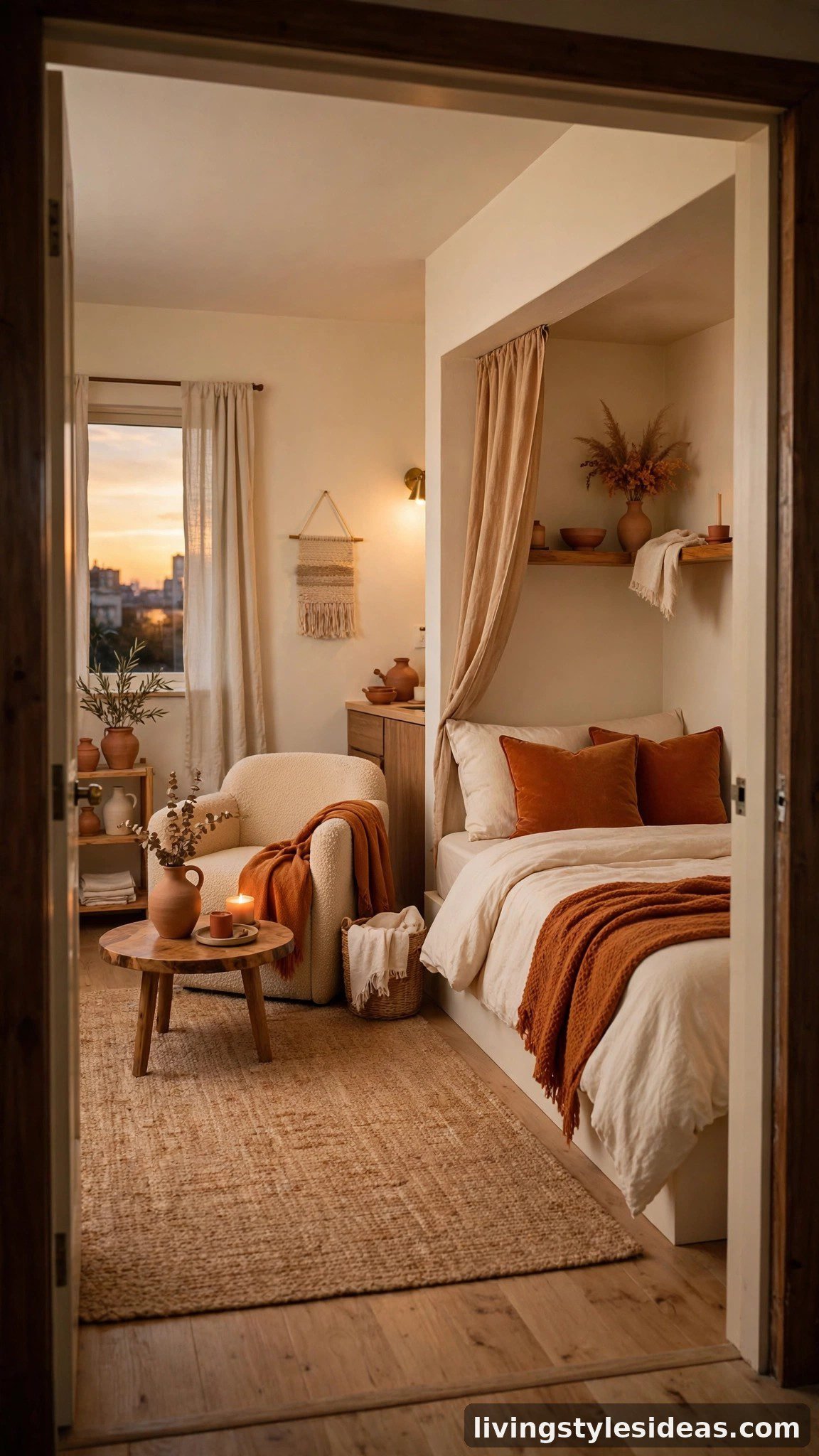
This palette pours warm light into a studio even on gray winter days. Let cream walls and bedding keep the space bright and open, then layer burnt orange throw pillows, a clay-colored vase, and a warm sand area rug under your coffee table. The earthy tones act like an extra blanket — welcoming, never heavy. Keep metals brushed brass or matte black so the oranges glow instead of clashing with cool tones.
2. Warm Greige Layers: Greige, Oatmeal, Soft Taupe & Ivory
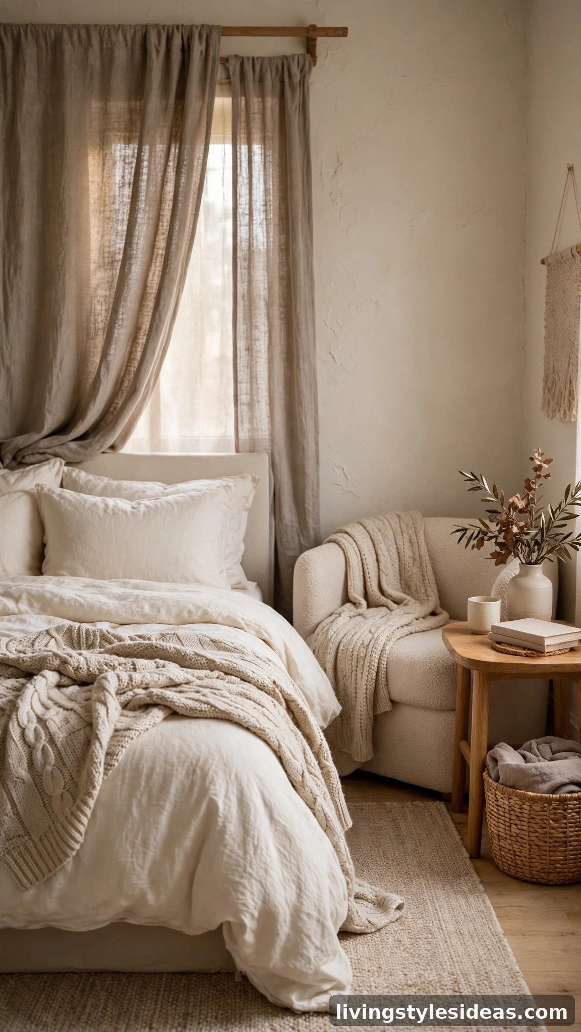
Greige — gray plus beige — is the small-space hero neutral because it has warmth without shouting. Build it in layers: ivory bedding, an oatmeal knit throw, taupe linen curtains, and a greige rug to anchor the sleeping zone. Texture does the talking here, so mix boucle, linen, and chunky wool in the same family. The result reads calm and expensive, and it lets one warm-wood piece steal the show.
3. Forest Retreat: Deep Forest Green, Moss, Warm Oak & Cream
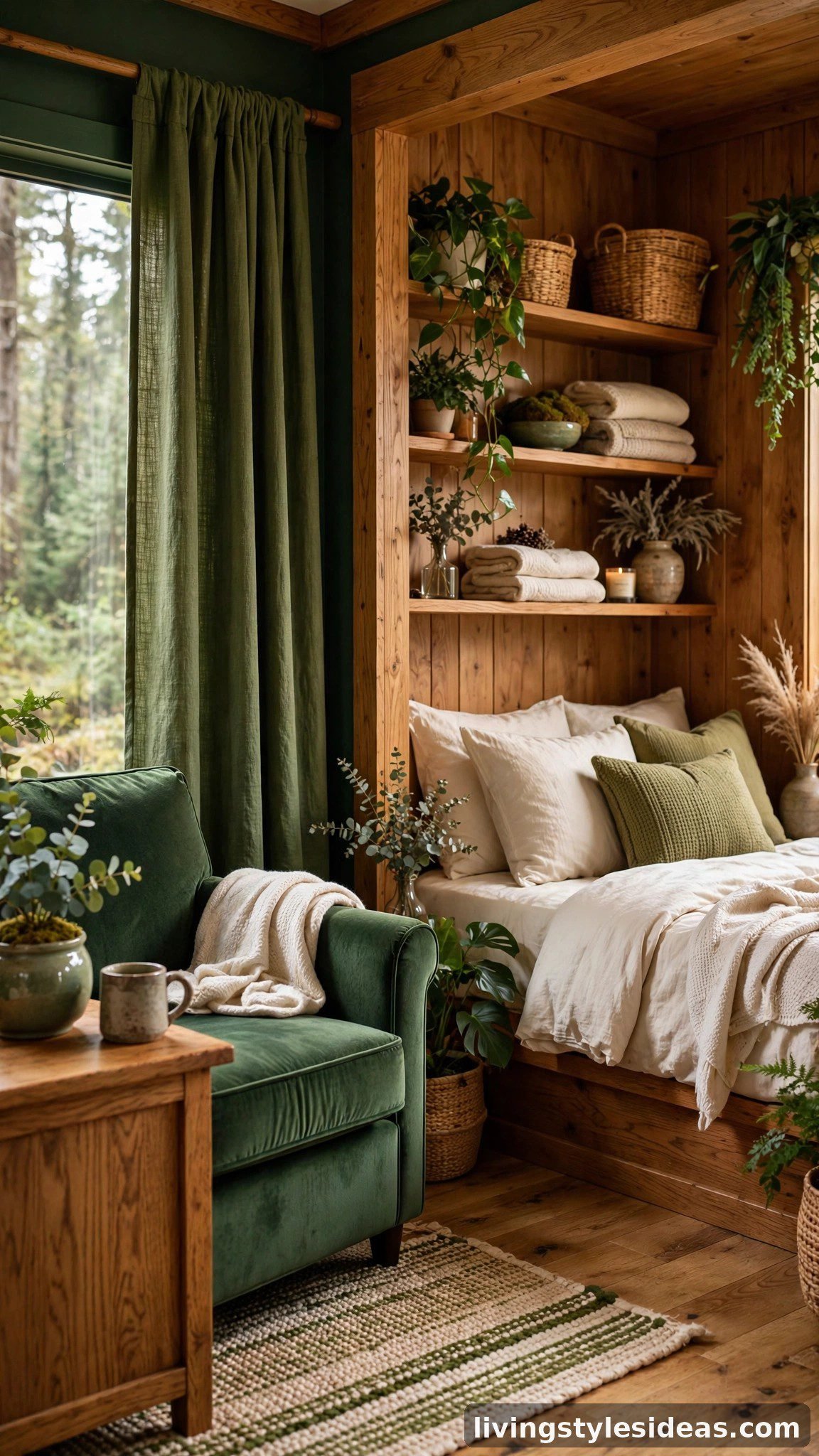
Deep greens make a studio feel like a cabin getaway. Use forest green on a single accent wall or a velvet accent chair behind your bed, moss green on curtains, warm oak on shelving or a side table, and cream everywhere else to keep it breathable. Add a couple of real plants — their greens blend right into the scheme. This palette hides visual clutter beautifully, which is a gift in one-room living.
4. Navy & Amber Glow: Midnight Navy, Amber, Warm White & Brass
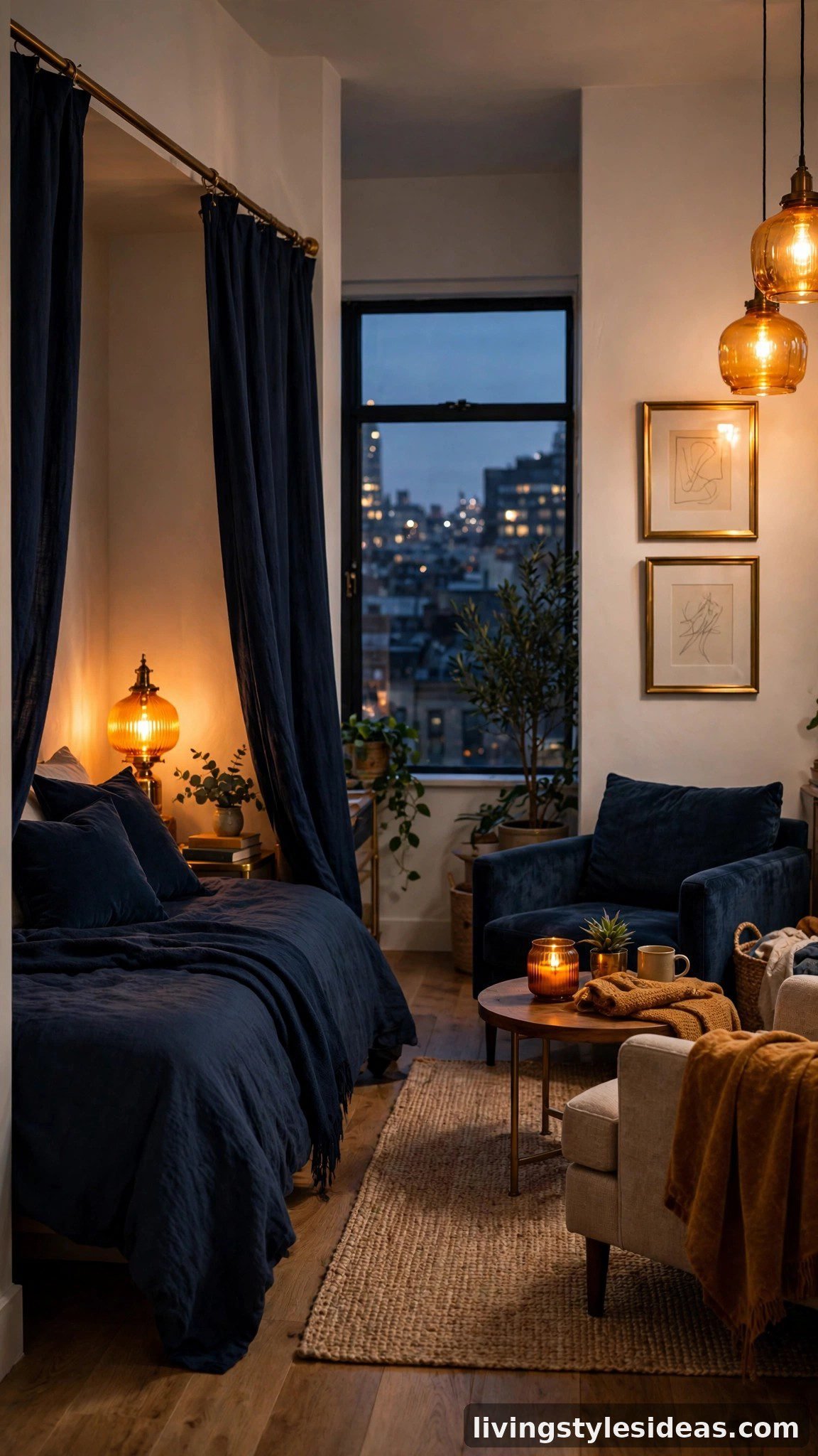
Midnight navy gives a studio evening drama without shrinking it — especially when it’s kept to bedding, an armchair, or a room divider curtain. Warm white walls bounce daylight around, amber glass lamps and candles add honeyed glow, and brass picture frames or hardware pick up the warmth. This high-contrast palette looks intentional and grown-up, and it photographs beautifully for anyone documenting their space online.
5. Blush Whisper: Dusty Rose, Blush Pink, Warm Gray & Cream
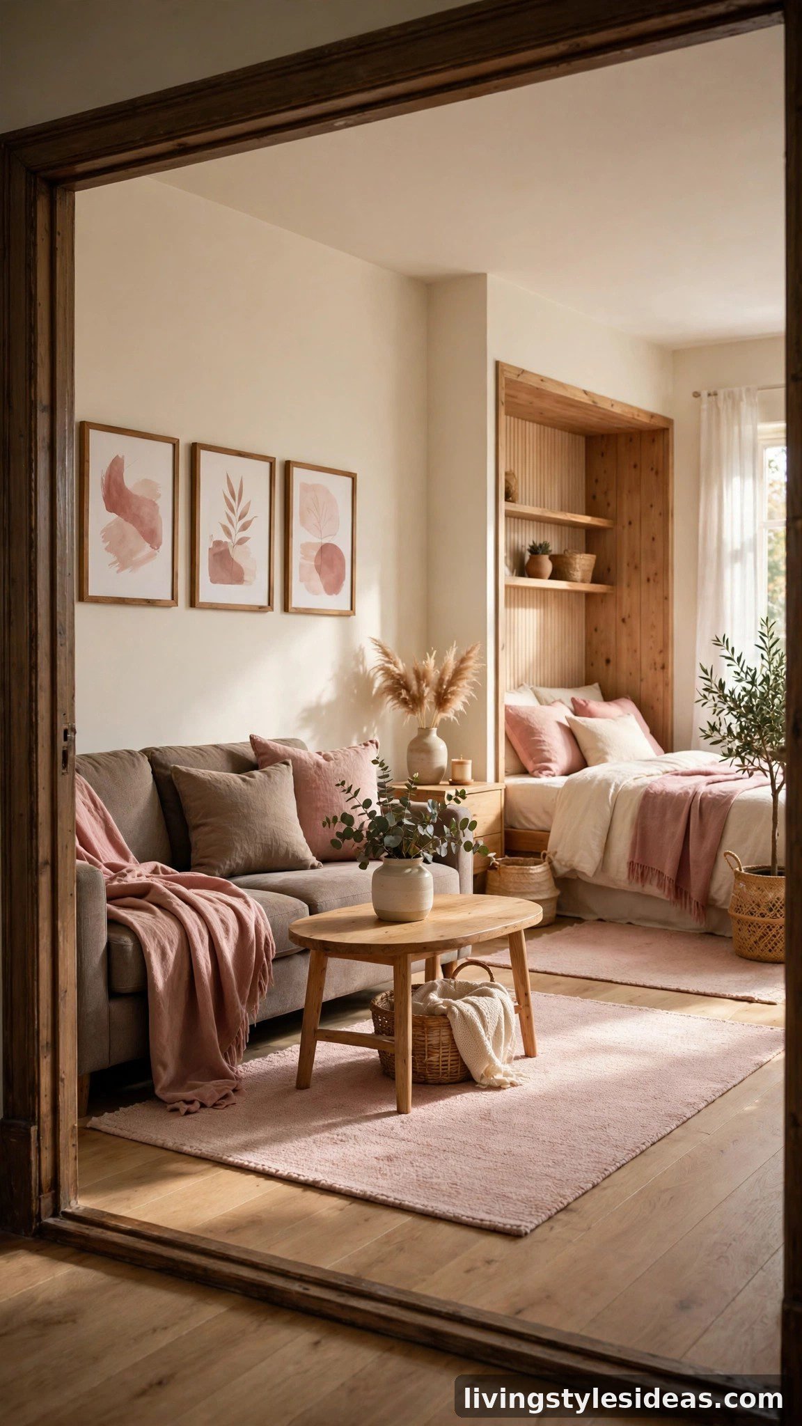
Think blush as a whisper, not a shout. Cream walls and warm gray upholstery form a calm base, then dusty rose appears in a throw, art prints, and a small rug by the bed. The pink tones read feminine and soft without tipping into “dollhouse,” and they pair surprisingly well with natural wood and black metal. In a studio, this palette keeps everything light while still feeling cozy and personal.
6. Olive & Linen: Olive Green, Natural Linen, Charcoal & Off-White
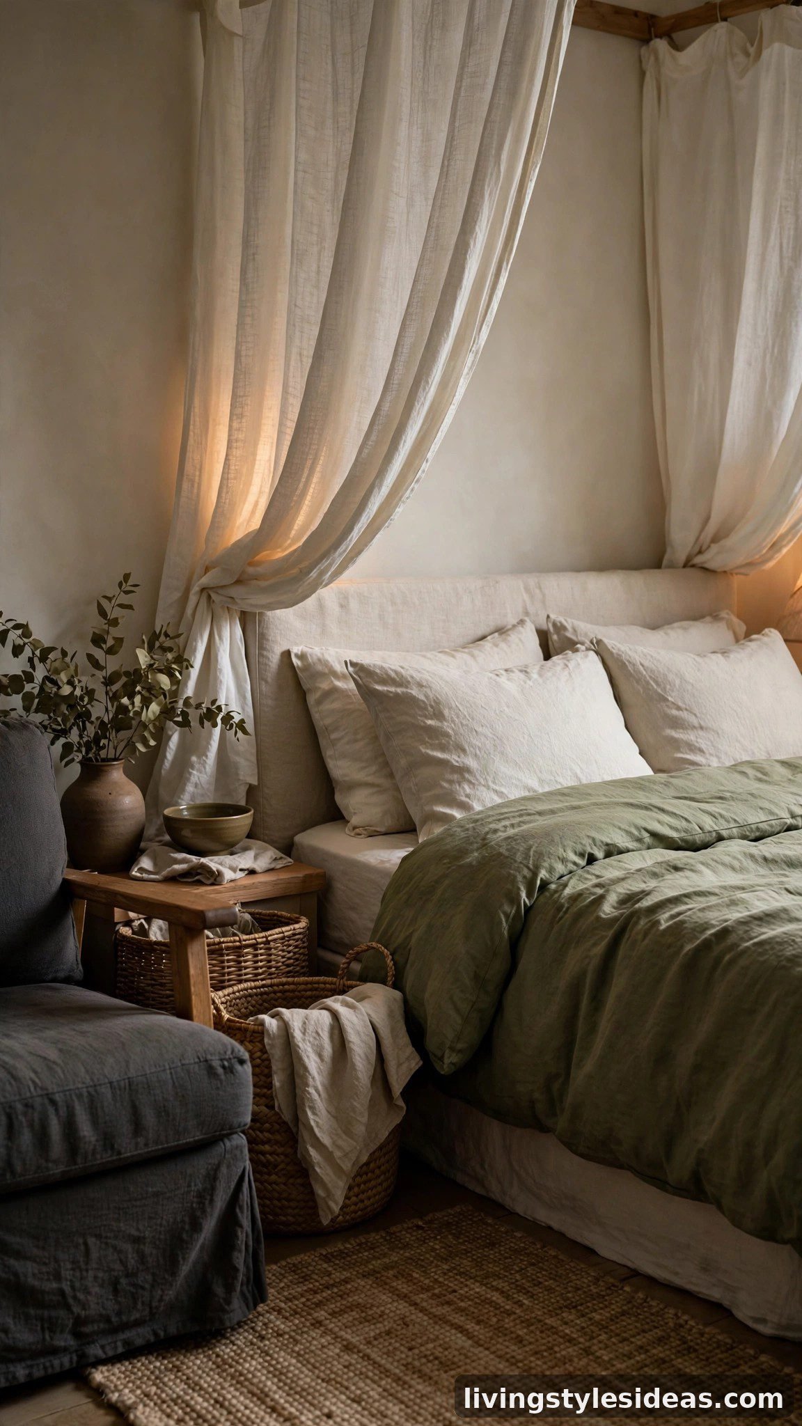
Olive green plus raw linen is the easiest way to make a rental studio feel curated. Off-white walls, linen-colored curtains and slipcovers, an olive green duvet or sofa throw, and one charcoal piece — a rug or an armchair — to ground the look. Everything is matte and textured, nothing shiny, which makes small spaces feel serene. Add woven baskets and a jute rug to double down on the earthy mood.
7. Cinnamon Spice: Cinnamon, Caramel, Espresso Brown & Cream
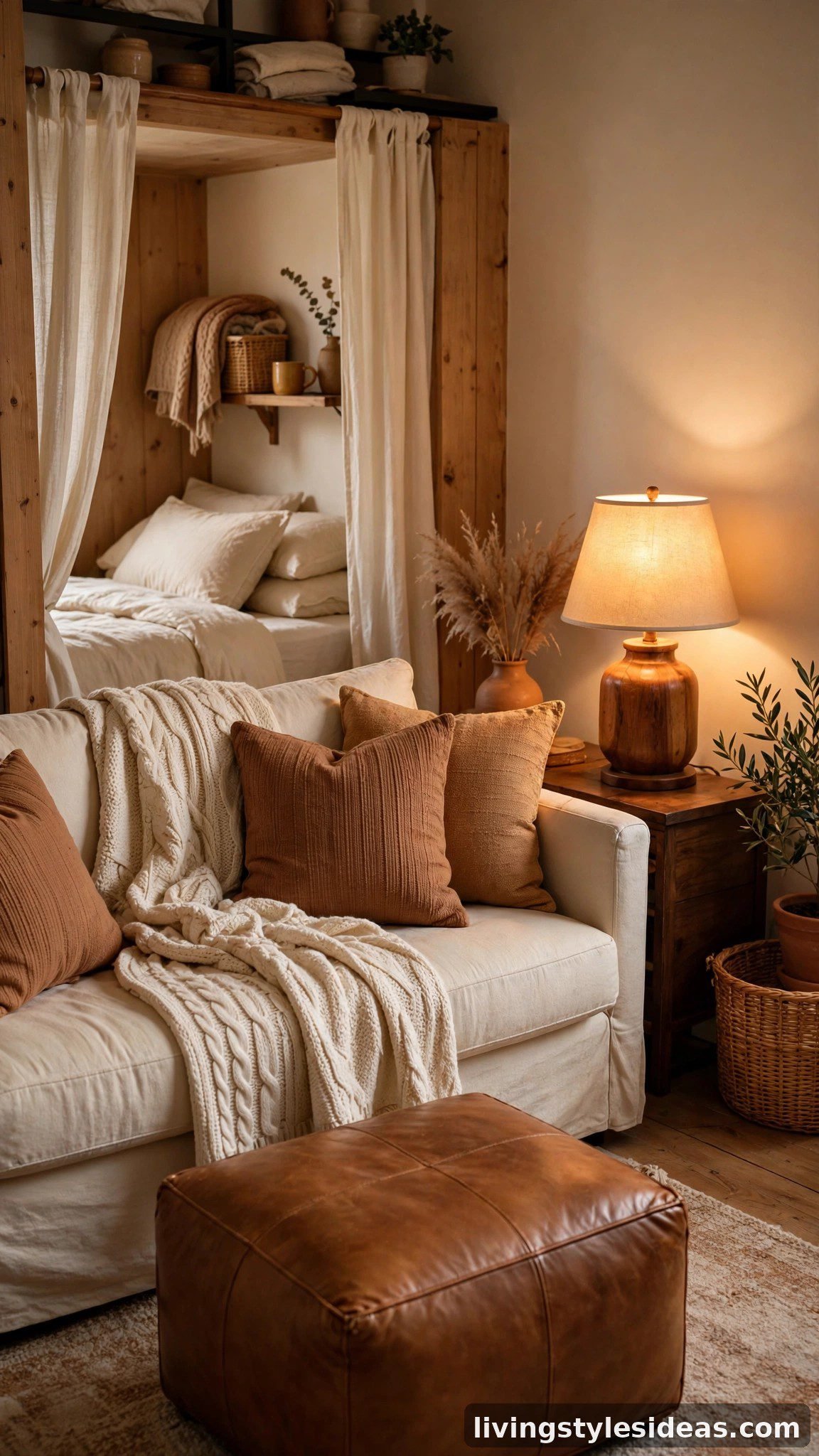
All the warm browns of autumn, and they were made for cozy studios. Cream bedding and curtains keep the room luminous, then stack cinnamon and caramel on cushions, a chunky knit throw, and a leather ottoman. Espresso brown works best in small doses — a picture ledge, a floor lamp, dark picture frames — so the room stays warm rather than dark. This palette practically smells like chai tea.
8. Dusty Blue Calm: Dusty Blue, Slate Gray, Soft White & Pale Oak
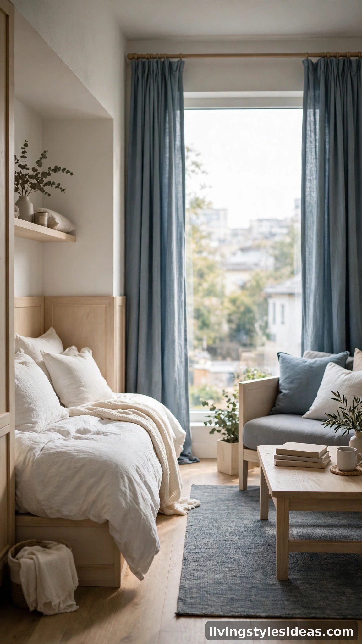
Muted blue is a proven small-space trick: it recedes visually, so walls seem farther away. Paint-free trick: hang dusty blue curtains floor-to-ceiling, add a slate gray rug, keep bedding soft white, and warm it all up with pale oak furniture and a cream throw. The palette feels calm and airy — ideal for studio dwellers who want coziness without the heaviness of dark, saturated color.
9. Charcoal Elegance: Charcoal, Graphite, Silver Gray & Crisp White
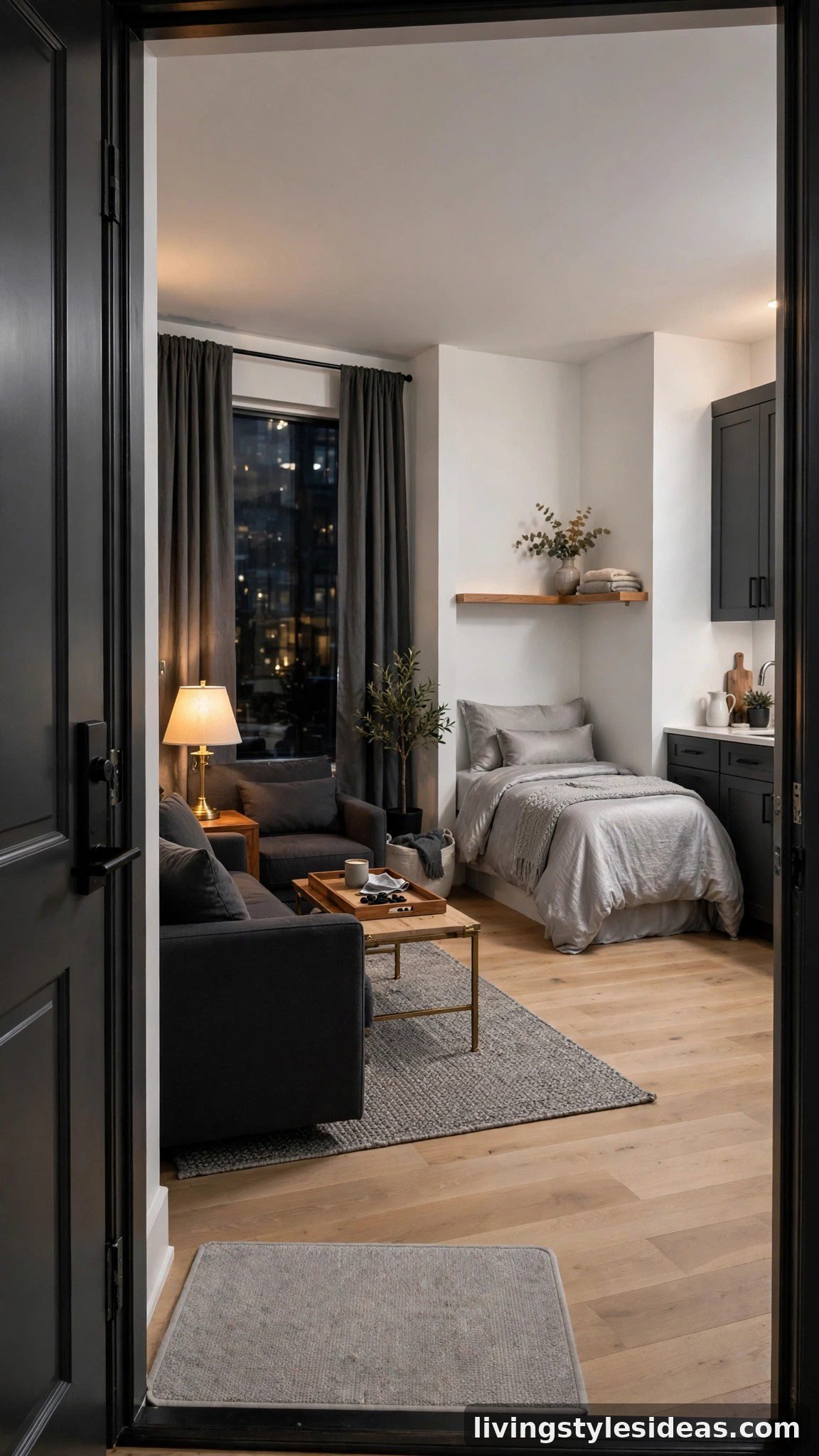
Don’t fear dark colors in a studio — charcoal used deliberately adds depth that makes the room feel larger, not smaller. Keep walls crisp white, then introduce charcoal through a sofa or a feature wall behind the bed, graphite gray curtains, and silver gray bedding. The trick is contrast: bright whites against dark grays make everything look crisp. Add one warm element — wood tray, brass lamp — to keep it inviting.
10. Golden Hour Glow: Golden Honey, Mustard, Warm Brown & Cream
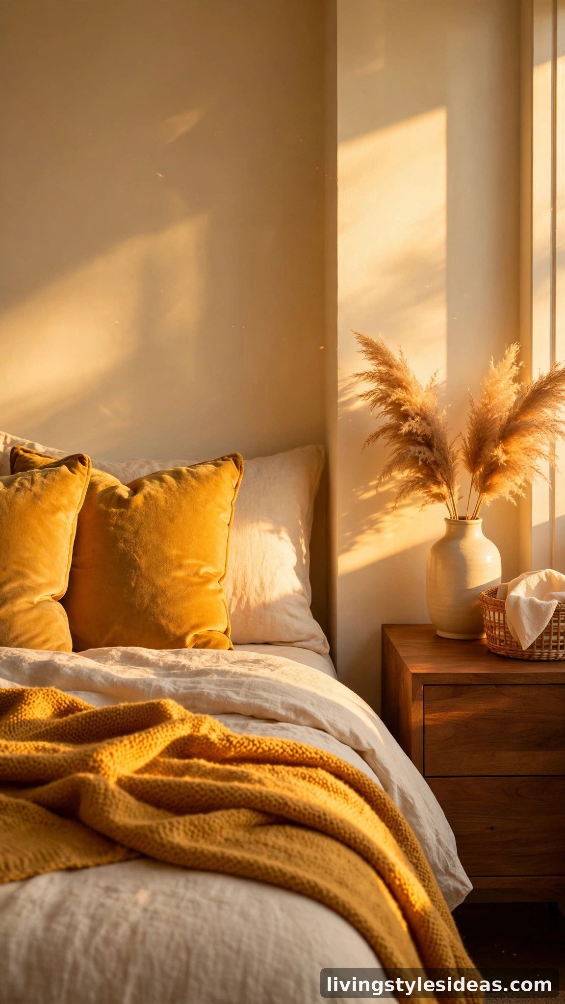
This palette bottles the happiest light of the day. Cream walls amplify natural light, while golden honey and mustard appear in cushions, a throw, and warm-toned art. Warm brown grounds it through wood furniture or a leather bench. In studios with small windows, yellows bounce what light exists around the room and fight the cave feeling. It’s a cheerful palette that still reads cozy, never neon.
11. Sage Serenity: Sage Green, Eucalyptus, Warm Sand & Soft White
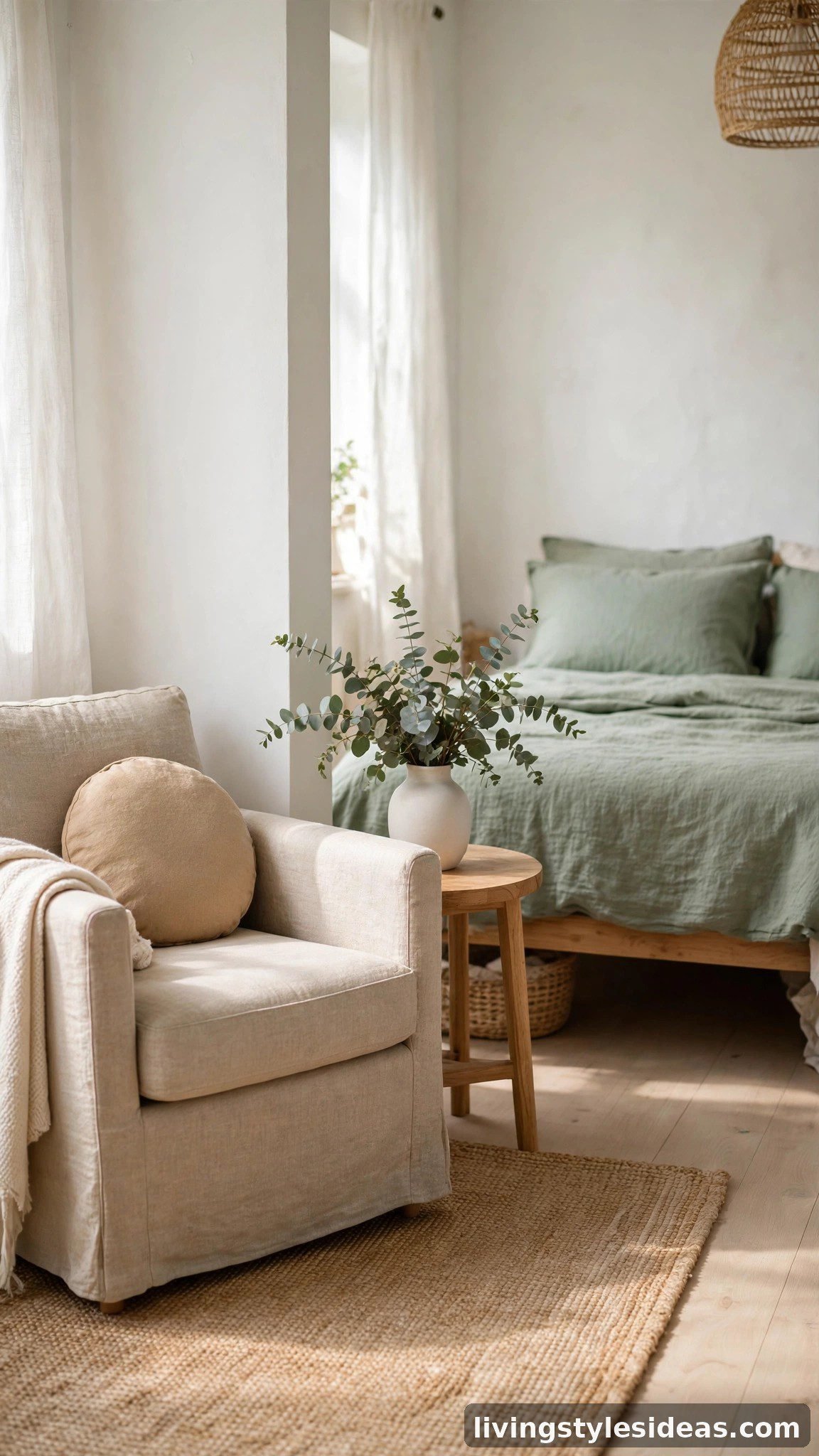
Sage is the gentlest way to bring color into a tiny footprint. Soft white walls, warm sand rug, sage green bedding or curtains, and a few sprigs of real eucalyptus on the table for scent. Because sage sits between gray and green, it shifts with the light — cool in the morning, warm at dusk — so your studio never feels flat. It’s the palette for people who want color without commitment.
12. Plum & Fig: Deep Plum, Fig Purple, Mauve & Warm Cream
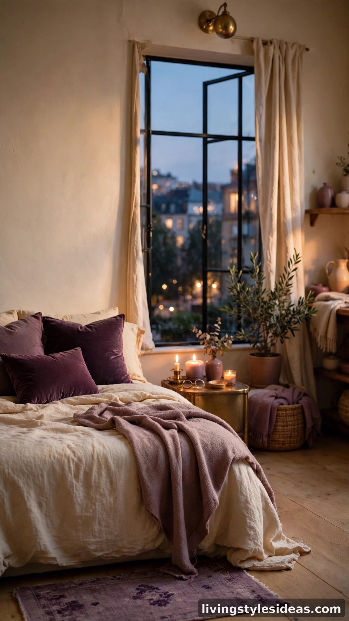
Rich but not heavy, plum brings jewel-box luxury to a small space. Anchor with warm cream walls and bedding, then layer deep plum in a velvet cushion pair, fig purple in a small rug or art, and mauve in a throw or candles. Because these tones are muted rather than neon, they read romantic and sophisticated. Brass or gold accents love this palette and lift the whole room after dark.
13. Monochrome Warmth: Warm White, Ivory, Soft Beige & Champagne
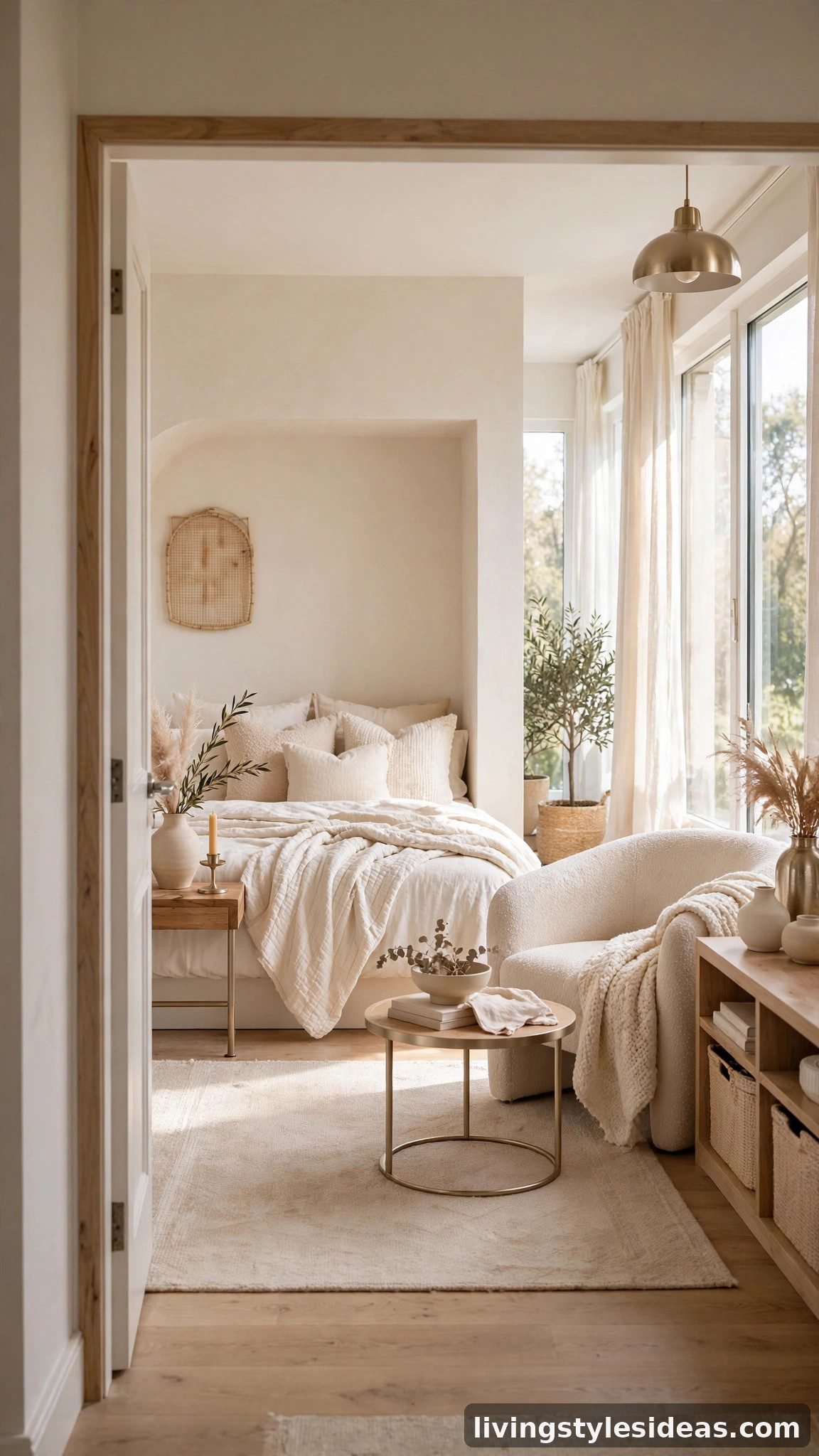
The lightest palette on this list — and a masterclass in how monochrome can still be cozy. Layer warm white walls, ivory bedding, a soft beige rug, and champagne-toned metals and glass. The coziness comes entirely from texture: waffle knits, bouclé, linen, and sheepskin in the same warm-white family. This palette makes a studio look twice its size and feels like living inside a cloud.
14. Emerald & Gold: Emerald Green, Gold, Dark Walnut & Cream
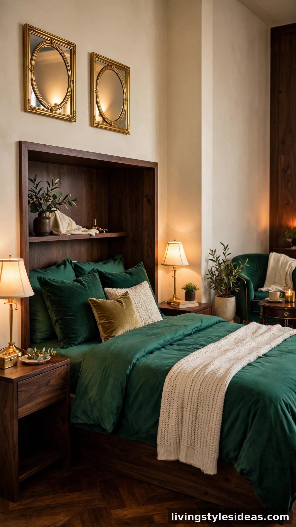
Emerald and gold is the boutique-hotel palette, and it translates beautifully to one-room living. Cream walls keep it fresh, emerald green takes the bed or a statement chair, dark walnut furniture adds richness, and gold arrives in lamps, frames, and mirror trim. The metallics are the key — they bounce warm light everywhere. Even one gold-framed mirror can make a 400-square-foot studio feel glamorous.
15. Coastal Dune: Sea-Glass Teal, Driftwood Gray, Sandy Beige & White
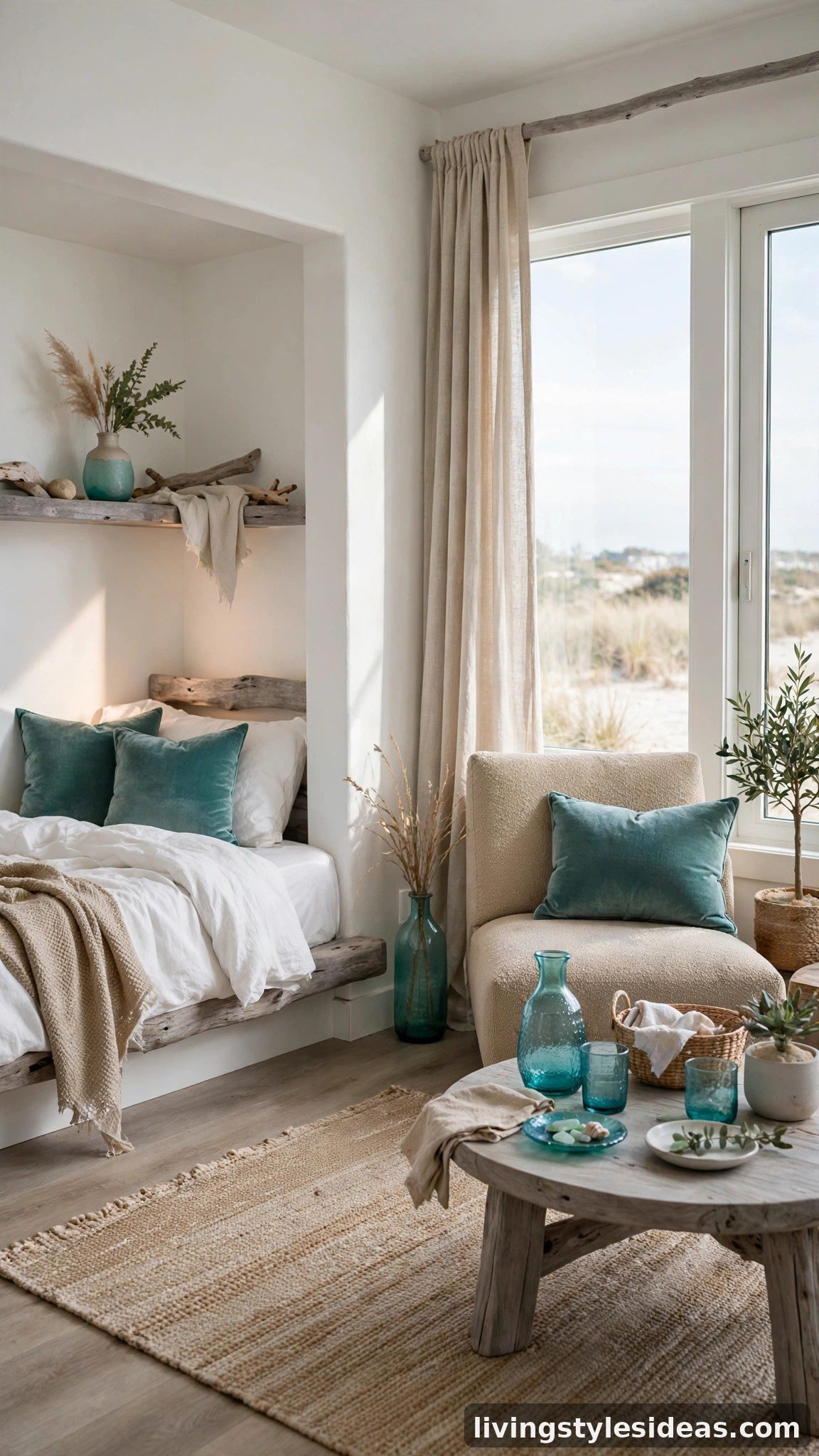
For studios that crave a vacation feeling, this beach-inspired palette stays calm and breezy. White walls, sandy beige rug and curtains, driftwood gray wood tones, and sea-glass teal in cushions, glassware, and one piece of art. It’s lighter than a full nautical theme and skips the clichés — no anchors, just color. The palette keeps small spaces feeling open, fresh, and quietly cozy year-round.
16. Rustic Ember: Rust Red, Burnt Sienna, Dark Walnut & Cream
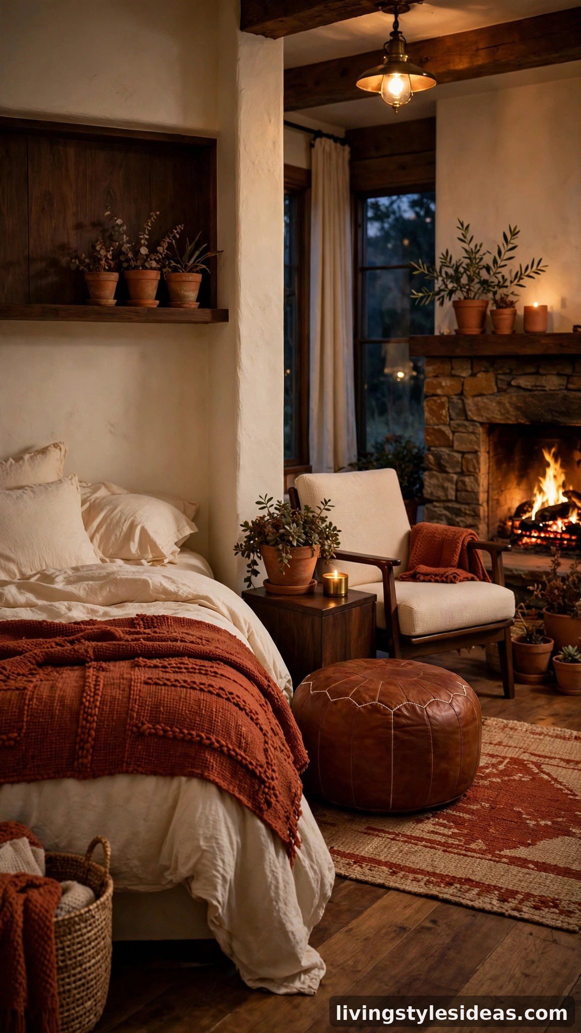
Rust red is the coziest “warm” color you can bring into a studio without going full red. Cream walls and simple bedding let rust and burnt sienna do the talking — on a woven throw, leather pouf, and terracotta pots. Dark walnut furniture keeps the look grounded and a little rustic. This palette shines in fall and winter, when its ember tones make a small room feel like a fireside cabin.
17. Lavender Haze: Muted Lavender, Gray-Lilac, Warm White & Soft Gray
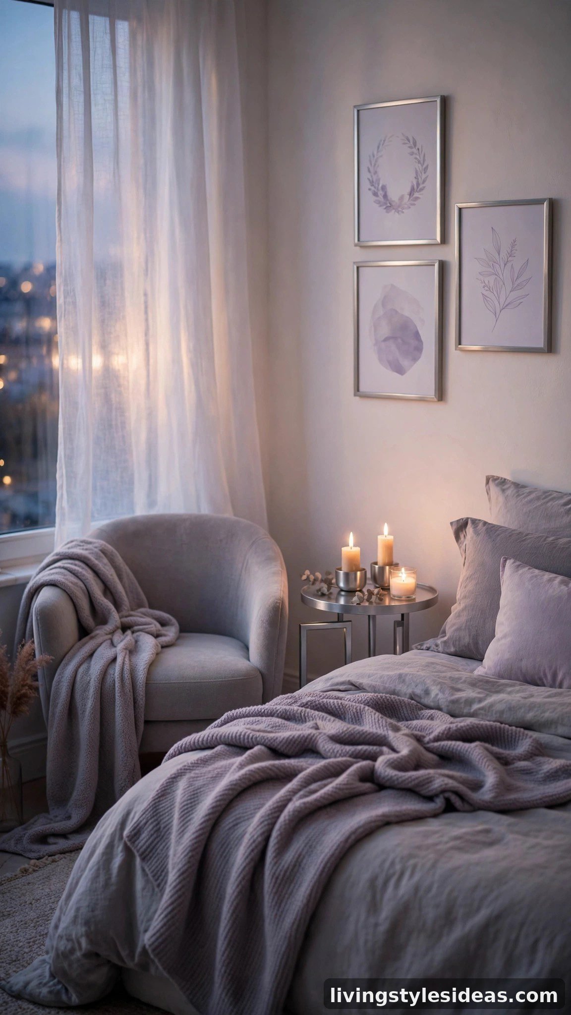
Muted — never neon — lavender is this year’s quietest color trend, and it’s lovely in a studio. Warm white walls, soft gray bedding, a gray-lilac throw and muted lavender art prints or candles. It reads calming and slightly romantic, pairs beautifully with silver or brushed nickel, and keeps the room feeling light. Perfect for night owls who want their one room to feel like a soft, dreamy retreat.
FAQ
What is the best color palette for a small studio apartment?
Light, warm palettes work best — think warm whites, greiges, and soft beige bases with a few deeper accent tones. They reflect light and make the room feel larger, while warm accents add the coziness that all-white rooms can lack. Pick one palette from this list and repeat its 3-4 colors across bedding, curtains, rugs, and art for a pulled-together look.
How do I make one color palette work for my whole studio?
Use the 60-30-10 rule: 60% of the room in your lightest color (walls, bedding), 30% in your mid tone (curtains, rug), and 10% in your boldest color (cushions, art, small decor). Because a studio is one open space, repeating the same palette in every zone — sleep, work, lounge — is what makes it feel calm instead of chaotic.
Can dark colors work in a studio apartment?
Yes, when used with intention. A dark accent — charcoal bedding, a forest green chair, a plum rug — adds depth that actually makes a small room feel bigger, especially against light walls. Avoid painting every wall dark, and balance each dark element with something bright or metallic so the room stays warm and inviting.
How many colors should a studio apartment have?
Stick to 3-4 colors per palette, plus the neutrals your walls and floors already provide. Fewer colors repeated consistently make a small space feel bigger and calmer, while too many unrelated colors chop the room up visually. If you love variety, swap your 10% accent color seasonally instead of adding more permanent colors.
Final Thoughts
A studio apartment gives you one room — which means one palette can transform everything. Pick the combination that matches how you want to feel at home: warm and sunny, calm and serene, or rich and dramatic. Start with your base (walls and bedding), add your mid tone (curtains and rug), then finish with your bold accent (cushions and art). Repeat those same colors in every corner, and your small space will feel bigger, cozier, and completely yours.